From the Apple 10K:
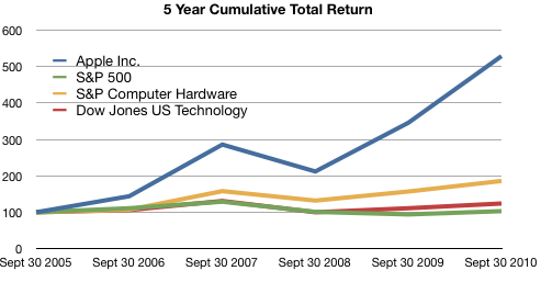
The following graph shows a five−year comparison of cumulative total shareholder return, calculated on a dividend reinvested basis, for the Company, the S&P 500 Composite Index, the S&P Computer Hardware Index, and the Dow Jones U.S. Technology Index. The graph assumes $100 was invested in each of the [securities].
In other words, if you had invested $100 in the S&P 500 in September 2005, you would have $103 now. If you invested $100 in Apple in September 2005, you would have $529 now.
Apple investors should rejoice!
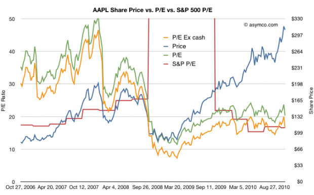
However, in terms of reward for earnings, consider the following graph:
The red line represents the S&P 500 P/E ratio and the green and orange lines represent Apple’s P/E ratios depending on whether you include cash in the price.
The reward to investors Apple does not seem so appealing anymore.
Although Apple received a premium valuation to the S&P prior to October 2008, it has traded at a discount or in-line with the S&P since then.
Another way of putting it is that the P/E ratio for large companies has returned to pre-recession levels. The P/E ratio for Apple has not.
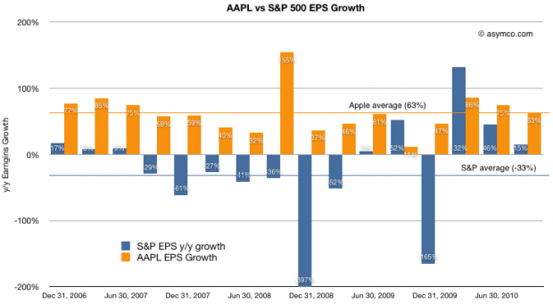
For a final point, a comparison of earnings growth (which should correlate to the P/Es) above shows that while the S&P is given a similar valuation to Apple, growth has been decidedly less spectacular.
Apple’s average growth over the period shown was 63% (shown as the orange line) while the S&P has grown at an average of -33%. Nevertheless the market has chosen to reward the two assets with the same multiples valuing their future growth in earnings roughly the same.
At least they are equivalent. For much of 2009 and early 2010, Apple was considered to have a far less promising future than the average large American company.
Discover more from Asymco
Subscribe to get the latest posts sent to your email.


