The reason we look at valuation is that it offers insight into how innovation is perceived. If a company is a successful innovator it usually creates vast wealth for its owners. However, the timing of that wealth creation depends greatly on its recognition by others. In other words, valuation lets you determine how recognizable innovation is. If your analysis tells you that a company is supremely innovative but nobody else recognizes this then you have an investable opportunity.
So with that in mind we like to compare industry and innovation analysis with what “the market” thinks about Apple.
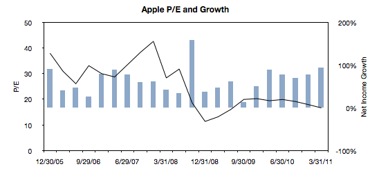
The latest method we had in mind was to compare P/E (a measure of valuation) and Growth. We’ve shown before that they seem to be moving in different directions. That’s not been news for over a year. What we will try to do now is to see if there is discernible change in the relationship before and after the financial crisis.
The following chart is a simple representation of P/E (line chart with left scale) with Net Income growth super-imposed (bar chart with right scale.) We chose a time period of 22 quarters. 11 quarters after the crisis (i.e. quarters after the one ending in Sept. 2008) and 11 quarters before the crisis (quarter ending 12/20/05 through the one ending 6/30/08).
We then plotted a scatter of all these pairs (P/E vs. Net Income Growth). Continue reading “Apple's P/E compression illustrated”

