Following the presentation of growth/PE of comparable companies in the previous post, here are charts showing the Growth vs. P/E as a scatter plot. I highlighted the quarters pre-crisis as red dots and the quarters post-crisis as blue dots. I also added a vector line showing the migration of the average (centroid) of the pre-crisis values to post-crisis values (11 points averaged in each case).
Day: September 12, 2011
Growth profiles of 13 companies
The previous article showing the profile of Apple’s growth vs. its P/E prompted a similar review of a set of comparable companies. The cohort is composed of:
Apple
HP
Dell
Lenovo
Acer
Sony
Samsung
LG
Nokia
RIM
HTC
Microsoft
Google
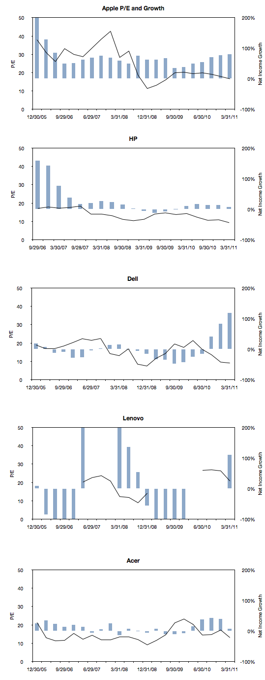
The following charts are a simple representation of P/E (line chart with left scale) with Net Income growth super-imposed (bar chart with right scale.) The time period is 22 quarters; 11 quarters after the crisis (i.e. quarters after the one ending in Sept. 2008) and 11 quarters before the crisis (quarter ending 12/20/05 through the one ending 6/30/08).
We made one change to the growth data from the previous post where the Net Income growth is not quarterly year-on-year but average of four quarters year-on-year. This reflects the fact that P/E is also a trailing twelve months’ earnings. It also has the benefit of smoothing the growth data making it easier to discern.
Here are the charts:


