
The adoption curve has been used to categorize adopters into groups by their behavior: innovators, early adopters, early majority, late majority and laggards. This categorization asserts that adoption is function of psychology, or the likelihood of people to act or react within social systems. [Rogers first edition 1962]
It’s a compelling model and has been proposed as a tool for firms to help with their marketing strategy. As diffusion proceeds through each adopter category, the product is re-positioned to address each group’s presumed behavior. Innovators (first 2.5% of the population) are offered novelty, a chance to experiment and uniqueness of experience; early adopters are offered a chance to create or enhance their position of social leadership; the early majority build imitate the leadership of the early adopters and justify it with productivity gains; the late majority are skeptics but, given a set of specific benefits, join the earlier adopters. Finally the laggards reluctantly agree to adopt as their preferred alternative of not adopting disappears.
The theory suggests that a firm can be successful if they modify their marketing and perhaps product mix to accommodate these adopter categories in a timely manner.
If this is the case however, why is it that those who have access to these data (i.e. who is buying and when) not to do the right thing? Why is it that during a technology adoption curve, there is a high degree of turnover in the firms which capture profits from the products that deliver this technology?
If you don’t believe this to be the case, consider the smartphone market. The data about buyers is easily obtained (even without paying a fee). Shown below is the US smartphone penetration data as obtained by comScore (including teenage survey data from Piper Jaffray).
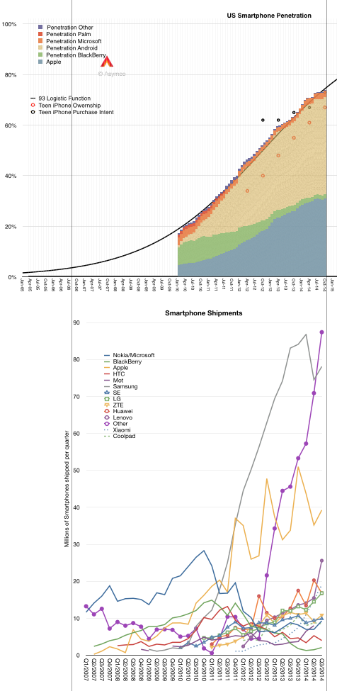
Following the penetration data there is a second graph showing the smartphone shipments for the largest vendors as well as the sum of the “others” which make up the difference with the total market. I used vertical registration lines to align the different data sets to the same time scale.
Having observed the market for some time, it’s possible to see a set of “epochs” which show the rise and fall of various platforms/vendors/geographic production areas. I applied these “epochs” as a rough sketch over the production data.
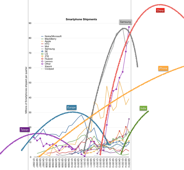
I define these epochs as:
- The Windows Mobile epoch from 2003 to about 2010 peaking in 2007. Competitors from Taiwan using Windows Mobile fielded a large number of devices and led that platform to win over proprietary Palm and Symbian.
- The Nokia/RIM epoch from 2005 to about 2012 peaking in 2010. Nokia’s distribution power takes its platform to global dominance. At the same time BlackBerry surges in popularity peaking at about the same time.
- The Samsung epoch from 2010 to (probably) 2016 peaking in 2014. Samsung surges from almost no smartphone volumes to double the nearest competitor in a matter of three years.
- The Chinese epoch from 2012 and ongoing. With a vast number of new competitors doubling or tripling sales over a few short years, “Other” becomes once again the bulk of volumes with additional brands like Lenovo, Huawei, ZTE, Xiaomi, Coolpad adding to the total.
- The (probable) Indian epoch from 2014. This epoch is not so much of or about India as the “local brands” which begin to have large, even majority, market share in markets such as India, Indonesia, Philippines, Vietnam, etc. This epoch is the triumph of the local over the global and represents the latter stages of adoption.
Now I deliberately left out Apple because, as can be seen in the shipments data, Apple never held a pre-eminent volume position. It is however a competitor with a steady rate of growth. So steady in fact, that it seems to mirror the overall market. Essentially, Apple shows that there is a potential for growth without competitive flux. A type of growth that is “systemic” rather than a function of some rivalry and hence turnover.
But Apple is an exception. As so often it tends to be.
The real puzzle is why are there so many turnovers in leadership in such a short span of time. The idea that five distinct eras can exist in a mere decade seems preposterous. These turnovers are not without economic drama. They are booms as well as busts. They happen in a market where there are literally billions of consumers spending the equivalent of $300 billion/yr. so the stakes are pretty high.
But it’s even more strange. If you super-impose the epochs on the (early) diffusion curve you can observe how a predictable adoption curve1 results in unpredictable success in the market.
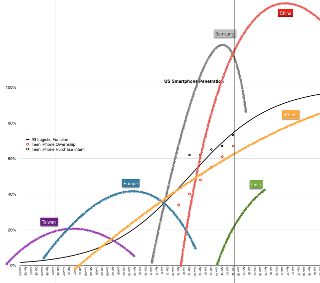
There must be something about the way companies behave *while* they are watching the evolution of the market. They seem to be running at a cycle time far faster than the market’s overall absorption rate. Is this because competition is forcing them to mis-spend their energies?
Could it be that the behavior of firms is also a function of the psychology and reward systems of managers? That they seem compelled to optimize for a time frame shorter than the economic lifespan of the technology? That this mismatch of phase between lifespans of a technology market and their profit model leads to premature demise of their market position?
- I.e. one whose shape can be determined well in advance and updated with very high precision [↩]