For more analysis of Apple & the industry, join us at ACTIVE 2025.

RIM and the lamentation of the analyst

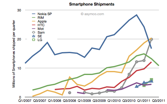
RIM shipped 10.6 million Blackberries and 200,000 PlayBooks in the last quarter. Management noted that their sell-through was significantly higher for Blackberry (13.7 million) but seems to be very weak for PlayBook as the prior quarter saw 500k units shipped. Additional PlayBook units this quarter probably mostly went into new channels in Asia and there were no additional sales into North America or Europe.

The figures for units are very poor. How poor depends on the frame of reference. Consider the shipment chart below:

In terms of the competition, 10.6 million units is less than half what Apple or Samsung sold in its prior quarter. It’s also less Continue reading “RIM and the lamentation of the analyst”

Mobile Impossible

In yesterday’s post about the “biggest mobile loser” I covered the exodus of users from non-smart devices in the US and EU5. I also said that what happens in those regions tends to happen in other regions with a time shift. In some regions it happens quicker but in most it happens more slowly.

But can we be sure that there isn’t vast non-smartphone growth in other regions? Well, no, we can’t be sure. At least not without access to reliable data.

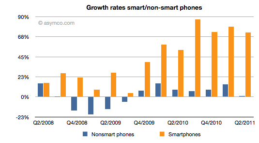
But what we can track is the overall non-smart phone market and compare it to the smartphone market. Here are the growth rates of the two sub-markets:

The difference is plain to see. We can also note that the non-smart market may be heading into a contraction–something noted by some analysts close to the market–but no real sign of that happening in smartphones.

Beside growth, we can also see actuals and the split of various vendors’ volumes in the market. Continue reading “Mobile Impossible”

5by5 | The Critical Path #6: Black Boxes

Horace and Dan tackle corporate valuation and hypothesize whether amateur bloggers know more about Apple than professional analysts. We also look at the ancient economic history of Windows and how that still shapes it today.

via 5by5 | The Critical Path #6: Black Boxes.

On iTunes: iTunes Audio

Biggest mobile loser? The non-smart phone

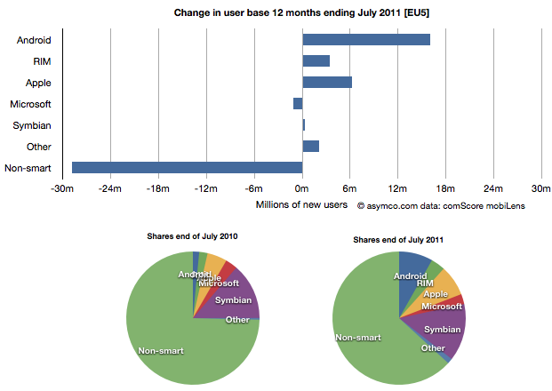
Yesterday comScore published survey results for EU5 (France, Germany, Italy, Spain, UK) on smartphone use and installed base. The headline is very similar to what would be written about the US: Android had phenomenal growth over the last twelve months. I also noted that the apparent growth of Google (16.2% share change) seemed to be matched by an apparent decline of Symbian (-16.1% share change.) However the reading of the data is not so simple.

In order to understand what has happened to usage, it’s much more valuable to look at consumption and the actual number of users rather than change in share of a subset of the market. Consider the following charts:

The bar chart shows that Continue reading “Biggest mobile loser? The non-smart phone”

Growth and punishment: The vector space model

After processing more than 1500 data points on the performance of thirteen technology companies, patterns are beginning to emerge. The steps so far:

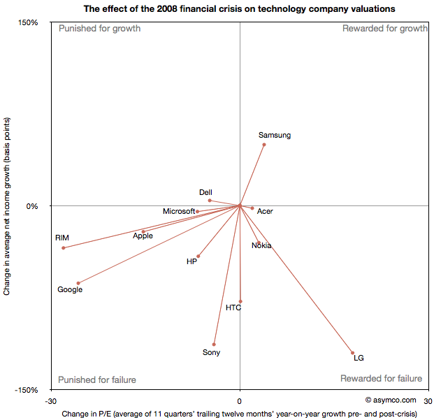
The final step is to plot the changes in the relationship between pre- and post-crisis for the set of companies normalized to the same starting point and then classifying them: 

The chart shows how the “average P/Es” changed after 9/30/2008 vs. how the companies performed during those periods. An evocative categorization is suggested for the four quadrants.

One way to read the data would be as a degree of effect of the crisis. Continue reading “Growth and punishment: The vector space model”

A comparison of P/E compressions

Following the presentation of growth/PE of comparable companies in the previous post, here are charts showing the Growth vs. P/E as a scatter plot. I highlighted the quarters pre-crisis as red dots and the quarters post-crisis as blue dots. I also added a vector line showing the migration of the average (centroid) of the pre-crisis values to post-crisis values (11 points averaged in each case).

Continue reading “A comparison of P/E compressions”

Growth profiles of 13 companies

The previous article showing the profile of Apple’s growth vs. its P/E prompted a similar review of a set of comparable companies. The cohort is composed of:

Apple
HP
Dell
Lenovo
Acer
Sony
Samsung
LG
Nokia
RIM
HTC
Microsoft
Google

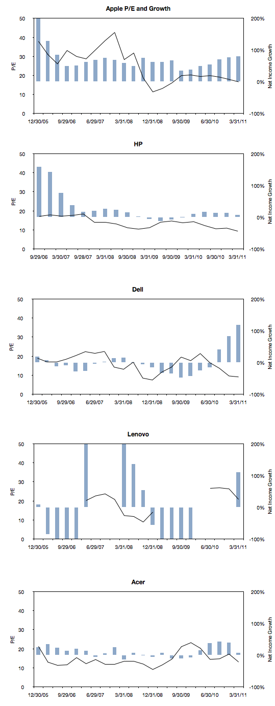
The following charts are a simple representation of P/E (line chart with left scale) with Net Income growth super-imposed (bar chart with right scale.) The time period is 22 quarters; 11 quarters after the crisis (i.e. quarters after the one ending in Sept. 2008) and 11 quarters before the crisis (quarter ending 12/20/05 through the one ending 6/30/08).

We made one change to the growth data from the previous post where the Net Income growth is not quarterly year-on-year but average of four quarters year-on-year. This reflects the fact that P/E is also a trailing twelve months’ earnings. It also has the benefit of smoothing the growth data making it easier to discern.

Here are the charts:

Continue reading “Growth profiles of 13 companies”

Apple's P/E compression illustrated

The reason we look at valuation is that it offers insight into how innovation is perceived. If a company is a successful innovator it usually creates vast wealth for its owners. However, the timing of that wealth creation depends greatly on its recognition by others. In other words, valuation lets you determine how recognizable innovation is. If your analysis tells you that a company is supremely innovative but nobody else recognizes this then you have an investable opportunity.

So with that in mind we like to compare industry and innovation analysis with what “the market” thinks about Apple.

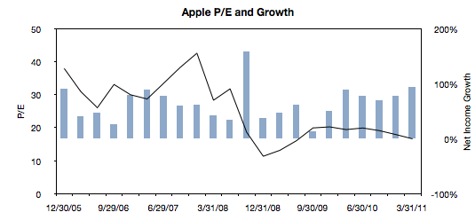
The latest method we had in mind was to compare P/E (a measure of valuation) and Growth. We’ve shown before that they seem to be moving in different directions. That’s not been news for over a year. What we will try to do now is to see if there is discernible change in the relationship before and after the financial crisis.

The following chart is a simple representation of P/E (line chart with left scale) with Net Income growth super-imposed (bar chart with right scale.) We chose a time period of 22 quarters. 11 quarters after the crisis (i.e. quarters after the one ending in Sept. 2008) and 11 quarters before the crisis (quarter ending 12/20/05 through the one ending 6/30/08).

We then plotted a scatter of all these pairs (P/E vs. Net Income Growth). Continue reading “Apple's P/E compression illustrated”

Why Apple's shares rose after Steve Jobs resigned

CEO resignations often cause share prices to rise. Witness the effect of the latest CEO departure on Yahoo!. This typically happens because CEO replacements are not necessary when companies are successful. In times of crisis, the market sees management change as a hopeful sign. But Apple is doing well. So it was commonly believed that if Steve Jobs were to leave the helm at Apple the stock would fall. However, as the chart below shows, the stock price has since risen.

Apple’s share price rise of 3% even out-performed the Dow Jones index, and this phenomenon is not for the short term only. The Jobs resignation sent Apple puts to one-year lows.

So how do we reconcile this? How can such a valuable person be priced as a liability? Continue reading “Why Apple's shares rose after Steve Jobs resigned”

Why Carol Bartz was fired

Occasionally I write articles titled “Why CEO X was fired.” You can read one here, and here and here.

These are allegorical stories. I don’t base the opinion on evidence but on perception of what’s wrong with a particular company’s strategy and then try to trace the point of strategic failure which should have triggered management change. Of course, the reasons are often something else, probably mundane or “political” in nature.

The objective therefore is to analyze strategy and more precisely strategy failure.

So, Yahoo! What went wrong?

Before we answer that, we should know what went right. Yahoo, like Google, depends on advertiser revenues. For that, it sells the behavior of its users. It processes over 25 billion events every day and builds a database (estimated to be in 10s of petabytes) to mine for information that is, hopefully, worth something to advertisers.

But in order to get user behavior it needs to provide compelling reasons for user participation. For that, Yahoo licenses content and offers communication services (among other things.)

This sounds like a reasonable business model. So what could go wrong? Continue reading “Why Carol Bartz was fired”

Asymco

Asymmetric Competition

Skip to content ↓