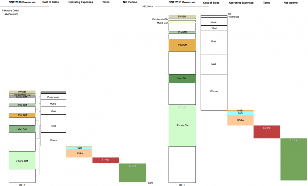
This graphic representation of the current and year-ago sources of income and sources of expense for the company shows how the business evolved in the last year.
The colored segments in the first column are Gross Margin contributions per product for Calendar Quarter 2, 2010. The white segments are cost of sales for those products. These costs are combined in the second column and the operating expenses are shown in the third column, taxes in the fourth and Net Income is shown in the fifth.
The same information is shown for Calendar Quarter 2, 2011. Click for larger view (1440 x 873 pixels)
The increase in the first columns is the “top line” growth and the increase in the last (fifth) columns is the “bottom line” growth
Similar charts for the last few quarters are shown here:
Combating superlatives fatigue | asymco
Summary view of Apple’s income statement [Updated] | asymco
Discover more from Asymco
Subscribe to get the latest posts sent to your email.

