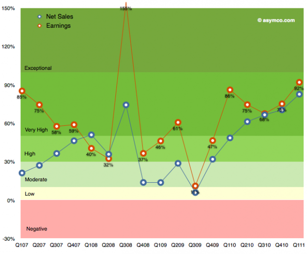
The following chart shows Apple’s growth for net sales and earnings over the last few years. I’ve used a grading system with color coding to show bands of growth.
It’s easy to become de-sensitized to the scope of these numbers, but it bears repeating: the growth has been steadily increasing since 2009.
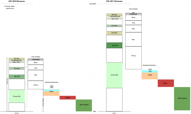
These abstractions in growth can also be shown in a direct “before-and-after” view of the income statement.
This latter view gives an idea of how much bigger the company’s business is now vs. a year ago. Not just on the revenues but also the cost of these revenues and what is retained.
This story never gets old.


