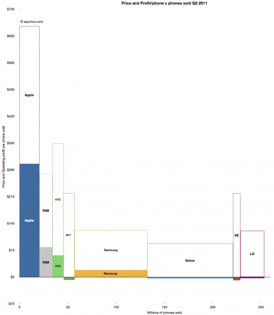
The profitability (aka Profit/Phone x Phones Sold, aka Rawr) chart is a great way to see the “shape” of the industry at a glance, with attention to volume and profitability.
What is missing however is a perception of the sales level and the pricing of the products. To help in that regard, I prepared an extension to the profitability chart which covers the price and sales for each participant.
You can interpret this graph as an extension of the profitability chart where the “empty” or white areas above each profit area are payments to suppliers and operating expenses. Thus the sum of empty and filled areas (above zero) are equivalent to revenues. If the sum of the empty and filled areas are greater then revenues (i.e. they extend below zero) then the difference is operating losses.
The top of both empty and filled rectangles are set at the average selling price per phone (and the top of each filled rectangle is the operating profit per phone). The width of both rectangles is the volume of phones shipped.
The things you can read into this chart are:
- Margins at a glance (ratio of filled area to total area)
- Sales as well as profit relative to peers (top of each box relative to others)
- Pricing power (overall top relative to competitors)
- Any combination of the above
Finally, the sum of all the areas are the overall market revenues for the quarter. Sum of white areas are expenses and sum of solid areas are profits & losses.
A natural evolution of this chart would be to animate it across multiple quarters/years.
Discover more from Asymco
Subscribe to get the latest posts sent to your email.

