
My estimate of last quarter’s iTunes gross revenues suggested a spending rate of $40 per iTunes account. It would make sense to consider how that figure changed over time. The following graph shows the pattern:
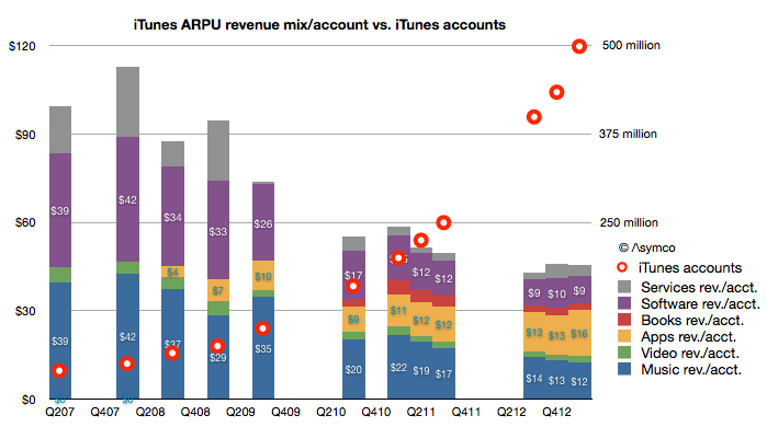
You can read each bar in the graph as the total “ARPU” or average revenue per iTunes user[1].
I overlaid a graph showing the total number of accounts as reported by Apple to the (retroactively) estimated revenue structure. Account totals are measured with the right axis and ARPU with the left. Note that I also broke down each component of iTunes as currently defined (Music, Video, Apps, Books, Software and Services.)[2]
The time frame covered is from Q2 2007, or the quarter prior to the iPhone launch. A few patterns emerge: Continue reading “The allure of iTunes”