I don’t know how many times I can re-write this story but here goes another try.
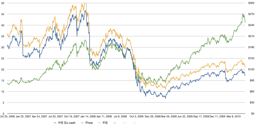
In the graph below I show Apple’s historic share price overlaid Apple’s P/E (with and without cash).
The share price is the line in green with the scale on the right and the P/E (trailing twelve months ex-cash) is shown in blue with the scale on the left. The P/E including cash (which is what is usually cited) is shown in yellow.
As the graph shows, while the stock has risen, the P/E has fallen. This is due to earnings accelerating faster than the stock price. As valuation is usually correlated with growth, it stands to reason that Apple continues to be discounted as a growth stock.
Discover more from Asymco
Subscribe to get the latest posts sent to your email.

