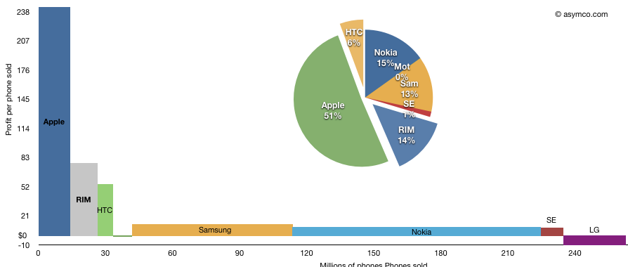
The following chart shows the third quarter’s profitability of eight top phone vendors as a measure of phones sold multiplied by profit per phone.
I’ve added the pie-chart showing the rectangular areas as a percent of available profit in the peer group. Note that LG losses are excluded from the pie chart but included in the area chart.
The total area represents total profit. This representation shows how the largest vendors make relatively little profit per phone but the large unit profit for Apple and RIM gives them a significant share of total industry profits.
Discover more from Asymco
Subscribe to get the latest posts sent to your email.

