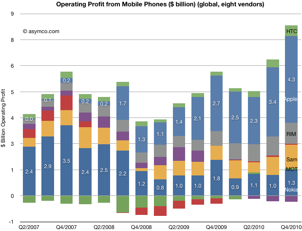
Today’s charts show the amount of profit captured by the top eight public mobile phone companies in two different ways.
The first, as a bar chart:

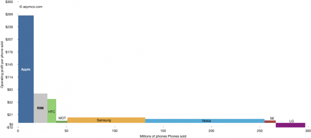
The second shows the way they captured it by taking into consideration the number of devices sold.
Please click on the image for a full size view (1024 pixels wide).
Generally speaking, vendors which are focused on smartphones have higher pricing and higher profitability (pricing discussion will follow at a later time). However, some, like Motorola and Sony Ericsson are still trying to recover from the collapse of their non-smartphone business and have higher prices but not very high margins overall. LG does not seem far behind.
Samsung and Nokia profit per device is quite small but they “make it up in volume”.
The areas above represent operating profits and are comparable. One wonders how the ratios between horizontal and vertical dimensions for these boxes will change over time.
Since the overall market will expand, the sum of all horizontal dimensions will increase. As the first chart shows, there is no law for the conservation of profits in the industry, so it’s possible that the sum of all these areas will increase, but it’s still hard to imagine it increasing by an order of magnitude.
Will the industry remain clustered into a tall-and-narrow group and a short-but-wide group? That’s a question with many strategic implications..

