Apple’s revenue for the first quarter was $24.7 billion, which at 83% was the largest quarterly revenue growth they ever experienced. Operating margin was an all-time high of almost $7.9 billion, representing 31.9% of revenue and yielding 95% EPS growth.
After earnings were announced the share price reached $350.7. This includes $70 in cash. Trailing twelve months’ earnings were $20.97. That makes the Price/Earnings ratio 16.7. Excluding cash, P/E is 13.4. The average growth over the past four quarters was 77%.
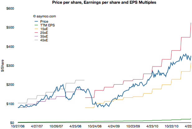
The following chart shows the share price vs. earnings. The green line is price and the blue line is share price. I also added multiples of the earnings to show how the stock traded in certain multiple bands.
During the period of 2006 to 2008 the company shares traded roughly in a range of 35 to 45 P/E. Since late 2008 the company shares have traded in a range of 15 to 25 P/E.
Share prices normally reflect potential earnings growth and past growth is often a good indicator of near term continuing growth. This is why the P/E is usually a proxy for growth. The faster the growth, the higher the P/E. Or so one would think.
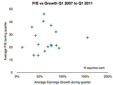
If we look at the P/E vs. earnings growth for Apple, the picture is not encouraging.
P/E and Growth don’t seem at all correlated. In fact, if we drop two outliers it almost seems that P/E is insensitive to growth.
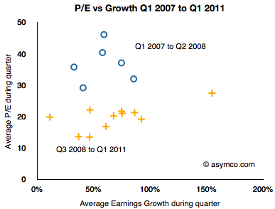
I took the data a step further and separated it into two clusters: pre-recession and post-recession.
The blue circles are Q1 ’07 to Q2 ’08 and the orange plus signs are Q3 ’08 to Q1 ’11. As the share price chart implies, there is a clustering of averages where during the 2007 and early 2008 period P/Es were in the 35 range while growth was in the 50s and P/Es below 20s with similar or higher growth ranges.
As the following scorecard shows, the company’s growth is exceptional. That does not seem to be something that is being valued by investors.


