
About a year and a half ago in Lasts Longer I noted that “keeping iPhones in use” became a top priority for Apple’s design for sustainability. I considered this provocative because it prioritizes usage and users over units sold, in contrast to how the company was perceived by investors. This new focus was reinforced by the company’s dropping of unit shipments data and the addition of Services data including subscriptions count and gross margins.
Apple effectively transformed itself into a services company with customer acquisition, subscriptions (measured by average revenue per user) and retention/satisfaction as key operating metrics. The 1.5 billion active devices and ~1 billion active iPhones and 500 million paid subscriptions are the new data points rather than units sold.
To succeed with this new Lasts Longer strategy, one of the objectives should be that devices become more durable and their durability should in-turn result in more minutes of use and thus more return on initial purchase price. But how can we measure this? We don’t have precise data on the use time. We have some anecdotes but no official data. We do know the iOS operating system is now designed to work on older hardware but that does not give us a measure of what is in use.
Luckily we now have an indicator that can help: Bank My Cell published a new data set on various used phone prices. This is a gold mine.
The data consists of prices for about 220 used phone models that changed hands in 2019. The prices are given for the beginning of the year (earliest date when the model was sold) and the end of the year (latest date when the model was sold.)
It’s thus possible to see how various models from a number of companies changed in price during the year. The date of initial release of the phones is also given (though initial selling price isn’t. It’s a bit tricky to determine initial selling price because the model may have been sold for an extended period of time and discounted through that period.)
What we do have allows comparisons between different manufacturers to see, especially for recent (late) models, just how big the drops have been in prices.
I recommend reading the original post to see some of the comparisons between brands. In addition I chose to illustrate some of the differences with the graphs below.
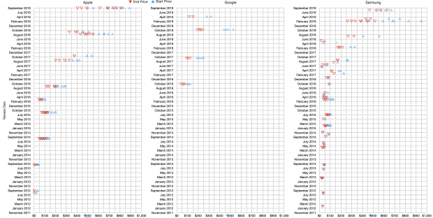
These graphs show phone model prices at the beginning of 2019 (blue) vs. the end of 2019 (red). The models are not individually identifiable but they are shown by the year of introduction. So, in the case of the iPhone, the 2019 cohort (those released around September 2019) are the top line, then the 2018 group is shown in the second line and on down. Thus the oldest iPhones traded during 2019 were iPhones 5, initially released in 2012.
To read the graph, you can scan each line to see the gap between the red and blue triangles to see how much the phones roughly fell in value. The comparison above is between Apple, Google and Samsung.
Here are some patterns I noticed:
- Google phones had larger drops during the year than equivalent iPhones. Just how much the drops were is listed by the original post: “Google lost an average of -51.68% between Jan-Dec 2019. The Pixel 3 (2018) was the fastest depreciating and highest value loss at -56.70% (-$267)”.
- The overall picture of Samsung’s phones is hard to discern. Flagship Android phones ($700+) dropped in value roughly twice as fast as Apple’s. But the the overall picture is messy. Budget phones are mixed with premium and the average pricing seems to quickly go near zero.
- iPhones have a more valuable “mid-range” for models more than 2 years old. Android phones fall hard in the mid range and cluster around zero quickly. This is the heart of the “old but valuable” proposition.
Depreciation rates might seem academic but depreciation is an indicator of a real perception of value and that in itself is a reflection of utility. Users are likely to pay for a used product only if they think it can still be useful in proportion to the price. New product buyers might pay for other things like prestige, status signaling or just wanting to be first. But used buyers are more mindful of what the product can do–they are less likely to benefit from signaling.
Analogously, the used car market often shows the underlying quality or reliability of a car model. If a luxury car plummets in value it means that it becomes a huge burden to late usage, usually due to servicing costs. In previous decades luxury cars were also durable cars but with complexity they became money pits.
In the used phone market hardware repair and maintenance are less consequential but there is a concern for software support, security and privacy. The serviceability of the battery, the camera quality and the fit and finish of the body matter.
Buyers are not stupid. The market speaks words of wisdom. A phone that is worth more will reflect more inherent utility. Remember that a phone is unlocked more than 80 times a day. If it has 4 years of use then it get unlocked 116,000 times. That’s not “uses” but unlocks. Actual usage in terms of taps, swipes, or glances could be triple that figure. There are phones on the list that are 7 years old. It’s not unreasonable to assume that a moderately well used iPhone has enabled a quarter million interactions.
Remember that phones are used all day, every day. At home and at work. In cars and in planes.
Even on weekends, and on holidays. And even when you’re “social distancing”.
In fact, the more physically isolated you are the more likely you are to rely on the phone as your social lifeline. In difficult times the product people turn to first and last isn’t one of luxury or frivolity. It’s a product that keeps you informed, connected, lets you help others and may even keep you alive.
It’s in difficult times that the true character of a product shines through. The smartphone, derided, mocked and blamed for all kinds of societal ills is what we turn to first to avoid getting ill.