The following chart shows the third quarter’s profitability of eight top phone vendors as a measure of phones sold multiplied by profit per phone. Continue reading “Making it up in volume? How to view unit profitability vs. volume in handsets”
Month: October 2010
Postcards for Asymco: metropolitan distribution of views by operating system
Based on a reader query, I tried to find out where, by city, my readership is concentrated. I also sought to break this audience down by operating system.
Here are some observations:
For the last 30 days, here are the top operating systems used to reach Asymco.com, with the number of views from each. Continue reading “Postcards for Asymco: metropolitan distribution of views by operating system”
Apple as mobile phone vendor: First in profit, second in sales and fourth in units
Change in top mobile phone vendor market, sales and profit shares rank over time: Continue reading “Apple as mobile phone vendor: First in profit, second in sales and fourth in units”
Last quarter Apple obtained 4% unit share, 22% sales value share and 50% of profit share
Pie charts showing 13 quarters of mobile phone market evolution between the largest vendors. Pure play smartphone only vendors are shown with exploded wedges. Continue reading “Last quarter Apple obtained 4% unit share, 22% sales value share and 50% of profit share”
Trading Places: How Apple climbed into the Top Tier
Apple reached fourth place in ranking of top phone vendors by units sold. I guess that makes it a “top tier” vendor.
So how did it get there?
Here is a chart showing how market share evolved since the quarter when iPhone launched:
Continue reading “Trading Places: How Apple climbed into the Top Tier”
iPhone share of all phones sold is now above 4% and continuing to rise
I am dead serious. I am now convinced that we have enough data to determine for a fact that Apple will not only see a dramatic decline in quarter-on-quarter sales in units of the iPhone this January-March quarter (which is the predictable pattern and no surprise) but that we will also see a decline in iPhone market share against at least HTC and Blackberry; that would be demoralizing news in itself. I know now that the numbers are clearly stacking up so, that the annual sales level of iPhone units, will result in a decline in iPhone annual market share in 2010.
Contrary to the loud and emphatic proclamations above, the data shows that the iPhone’s market share gains have been steady.
The following chart shows iPhone market share by quarter with a 4-quarter moving average. Total market size is reported by IDC. Continue reading “iPhone share of all phones sold is now above 4% and continuing to rise”
Apple trading even with the S&P 500
From the Apple 10K:
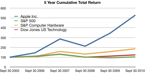
The following graph shows a five−year comparison of cumulative total shareholder return, calculated on a dividend reinvested basis, for the Company, the S&P 500 Composite Index, the S&P Computer Hardware Index, and the Dow Jones U.S. Technology Index. The graph assumes $100 was invested in each of the [securities].
In other words, if you had invested $100 in the S&P 500 in September 2005, you would have $103 now. If you invested $100 in Apple in September 2005, you would have $529 now.
Apple investors should rejoice!
However, in terms of reward for earnings, consider the following graph: Continue reading “Apple trading even with the S&P 500”
Turley Muller: Warranty Expense Crimps Apple's Margins in 4Q10
If estimated warranty expense had remained constant in absolute dollar terms ($150M), GM would have been 38.4% vs 36.9%. If If estimated warranty expense had remained constant in as a percentage of revenue (1%), GM would have been 130bps higher at 38.2%.
via Financial Alchemist: Warranty Expense Crimps Apple’s Margins in 4Q10.
Muller spots the culprit in the margin drop. He notes that this is money set aside and may have been in anticipation of returns of the iPhone 4 due to antennagate. Note how in 3Q cost of claims was 155 and accruals were 157, about a 1:1 ratio whereas in 4Q costs were 286 and accruals were 457 about 1:1.6.
It’s possible that if the costs this quarter do not materialize then we could see a margin upside surprise.
(Contrast this insight with today’s large scale sell-off in shares due to mass media repetition of earnings guidance from the conference call as shocking “news.” See also evidence of unlawful trading behavior here.)
LG continues to lose money in mobile phones
LG saw its profit fall apart today as its summer results were hurt by its weakness in phones. Its profit plunged 99 percent, down from $805.6 million a year ago to $6.7 million. The Korean company was dragged down by its mobile group, which had a record loss of $270 million. The company’s total phone shipments also dropped, going down 10 percent from year to year at 28.4 million.
via LG profit collapses based on shrinking phone sales | Electronista.
Q3 numbers show that LG had a drop in ASP as well. The unit numbers are down sequentially from 30.6 million in Q2.
Re-framing the dichotomies: Open/Closed vs. Integrated/Fragmented
Google likes to market itself as “Open” in contrast to “Closed” alternatives.
Apple likes to market itself as “Integrated” in contrast to “Fragmented” alternatives.
These dichotomies are judgmental and meant to portray “us=good” vs. “them=evil”. Neither gets to the point of how the two companies are structuring their businesses relative to the mobile computing value chains and clouds the judgement of observers.
I propose using a more informative and less judgmental distinction. It’s a division defined clearly by Clayton Christensen in his classic “The Innovator’s Solution” from 2003.
He introduced the concept of interdependent vs modular systems. Continue reading “Re-framing the dichotomies: Open/Closed vs. Integrated/Fragmented”

