Since reporting on the 18th, I’ve mostly finished going over the the fourth quarter Apple data. Here is a quick summary of the articles that covered the financial and product performance:
| Subject | Article |
| Cash | Having added $20 billion last year, Apple’s cash growth suggests total could top $100 billion next year |
| Growth | Apple’s Growth Scorecard: 63% average earnings growth over 16 quarters |
| iPhone pricing | The end of exclusivity doesn’t change the price operators pay for the iPhone |
| Sales by product | 65% of Apple’s sales came from iOS powered devices |
| Next quarter’s estimates | Estimates for Apple’s second quarter earnings (ending March) |
| Share price/valuation | Is Apple a candidate for acquisition? |
| Margins and platform mix of profit | iOS enables 71% of Apple’s profits. Platform products power 93% of gross margin |
| Cannibalization | iPhone and iPad: Fine Young Cannibals? |
| Operational Expenses | $76 billion a year from a tableful of products |
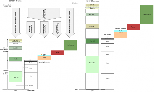
That leaves one more: Summary view of cash flows.
After introducing it last quarter, this is a chart that I’m trying to improve and use as a single snapshot of growth, product mix, profitability, cost structure and overall sales. The purist in me likes to see the chart clean but it can be a puzzle to some. So for the sake of explanation, this time I’ve added some annotations to the year-ago quarter.
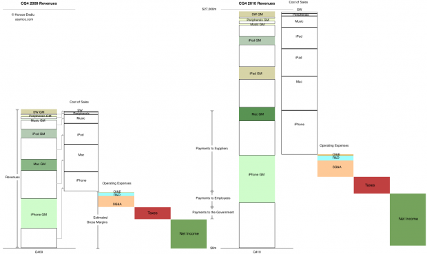
The left half shows flows in the same quarter a year ago and the right side shows the flows in the fourth quarter just ended December 2010. You can see where sales came from, how much of each product’s sales went to suppliers and how much was available to pay employees (and who got what). You can also see how much was paid in taxes and what was retained.
Please click on the figure (requires no scrolling when viewed on screens wider than 1464 pixels).
[Update] Alternate view using “waterfall”.
Discover more from Asymco
Subscribe to get the latest posts sent to your email.


