As Verizon has reported iPhone sales for one and a half quarters, it’s time to try to discern the impact on the product. There were several hypotheses floating around prior to the “big bang” of Verizon.
Some assumed that there would be a large migration away from AT&T and that AT&T iPhone sales would slump. Others that there would be no Verizon iPhones volumes at all because there were so many Android users already converted. There were also suggestions that the iPhone would explode in growth with two major operators carrying it.
What really happened?
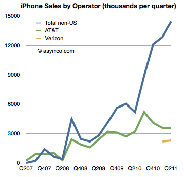
The first chart shows historic AT&T activation with Verizon activations added. It also shows sales to “none of the above”, namely non-US sales of iPhones[1].
AT&T iPhone activations show no significant impact from Verizon and Verizon itself shows a modest start to sales[2]. What did not happen is an exodus from AT&T. We also did not see a rejection of the iPhone by Verizon customers long exposed to anti-iPhone Droid advertising. We also did not see a considerable impact of Verizon on growth.
Verizon did contribute (4.5 million Verizon iPhone users is nothing to sneeze at) but the contribution was to a degree that was nowhere near a big bang.
That was because the real big bang was from the rest of the world. The same data in the first chart is shown below as a stacked area chart and a share chart. Had Verizon not come on board the business would still have grown year-on-year over 100% (and sequentially). Continue reading “The Verizon small bang”


