For more analysis of Apple & the industry, join us at ACTIVE 2025.

5by5 | The Critical Path #20: Below the (belt)line

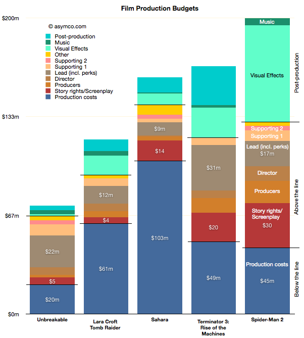
Horace and Dan begin a journey through the financial carnival that is Hollywood and talk about the wonders they encounter.

via 5by5 | The Critical Path #20: Below the (belt)line.

During the show I refer to the diagram below which represents the allocation of costs of production for a sample of movies:

Apple's commoditization discount

When asked where Apple’s growth will come from, most analysts or observers will cite new products. As long as there are new products, then there is growth. Conversely, if there are no new products, then there will be no growth. This is such a commonly held belief that it’s axiomatic: Apple is being valued based on short-term foreseeable growth.

To be more precise, analysts value the wave of growth of every new product and heavily discount the post-growth phase assuming commoditization. There is no value assigned to Apple for extending market reach to the mass market.

Consider: Analysts currently forecast an operating income (or EBIT) of $43.3bn for 2012 and $49.7bn for 2013. That implies growth of 28% in 2012 and 15% in 2013. These growth rates are modest in light of Apple’s recent historic growth and especially 84% in 2011 on EBIT level. Much of this growth has been due to iPhone which quickly captured 4% market share in four years. To suggest 15% growth in 2013 is to suggest that Apple will not increase its phone market share by an appreciable amount. The implicit assumption in that growth figure alone is that Apple will remain a niche player.

Continue reading “Apple's commoditization discount”

Interactive Apple Analyst Data

As the quarter is now at an end, it’s time to once again review the performance of Apple’s most highly paid observers. The data set linked includes published quarterly forecasts starting quarter ending June 2008 to quarter ending September 2011. Thanks to Philip Elmer-Dewitt who collected and processed the data over several years.

Apple Analyst Data | asymco. (Requires Flash)

As with previous interactive data sets, this is based on Motion Charts “gadget” in Google Docs. Try selecting the Motion Charts tab at the bottom of the page and hit the play button.

The way this is set up now is that the origin (0,0) represents actual performance (labeled as “Oppenheimer”). Every bubble is an analyst’s performance measured as a distance from actual. The further the location of a bubble from origin, the worse the error. Placement above zero (or to the right) indicates over-estimation for Revenues (and EPS). Placement below zero (or to the left) indicates under-estimation. Color of bubble represents affiliation (professional or amateur). Size of bubble is iPhone unit error.

You can change the axes, chart type (tabs in upper right), size, colors, and track individual analysts’ performance (by checking a name checkbox). Or just download the data and analyze on your own by selecting from the Data tab.