
On assessing demand from “supplier checks”; measuring headroom and the race to a billion users; the disruption of computing becoming accepted by PC industry.
Year: 2013
The iPhone MOQ
[Kaoru] Kato, president of NTT DoCoMo Inc., said that the firm would want to add the iPhone to its lineup of serviced smartphones if it could form a mutually beneficial contract with Apple, Inc.
Apple requires that carriers servicing its devices sell a fixed amount per year. Katō said that his company could handle such quotas if iPhones accounted for approximately 20%-30% of its overall smartphone sales.
via NTT DoCoMo President Interested in Servicing iPhone — BrightWire
When thinking about an iPhone launch, especially with a new operator, the crucial question is what is the minimum order quantity (MOQ). Some of the iPhone production is sold direct (as in the case of orders coming from Apple’s online store) but the majority of units are sold via operator who order in batches.
This issue came to light when Sprint’s order was leaked in late 2011. I discussed the order size at the time and put it in context. I concluded that Sprint MOQ was on average 7 million/yr., ramping with 4, 6, 9 and 12 million over a four year period. I concluded that this was not a particularly aggressive gamble.
Data published since then shows that Sprint actually sold 6.3 million during the first year, well ahead of my expected minimum order of 4 million and above even the expectations for the second year of sales. So far then Sprint and Apple gauged minimum demand quite accurately.
I also showed that the Sprint MOQ was probably indexed off their sub base. I suggested that, based on subs data at the time, Sprint was committing to roughly 13% of its subs buying an iPhone every year. This was indexed off the data showing that 17% of AT&T subs were buying iPhones every year and 10% for Verizon. (I also assumed that this run level would be ramped over time).
The updated totals for the 12 months ended October 2012 are 19% of AT&T subs purchased an iPhone, 12% for Verizon and 12% of Sprint. The performance is shown in the following graph:
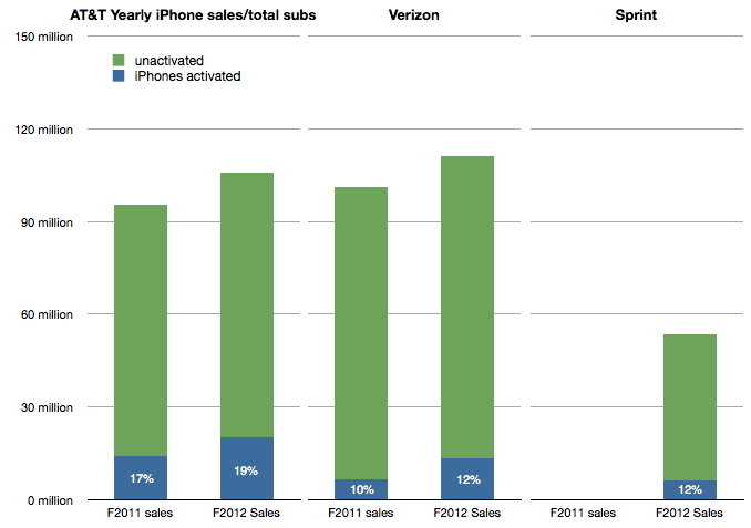
Which leads us to think about how the MOQ for the iPhone is calculated. If we assume Sprint and Verizon performance is typical it would imply that an operator like DoCoMo would be required to purchase iPhones at the rate of about 10% to 12% of its sub base each year, modulated to some degree by a ramp.
NTT DoCoMo had 60.7 million subs in September 2012. 10% is about 6 million. Is Mr. Kato’s quote above of 20%-30% of smartphone sales consistent with this?
In an earlier interview (in July) Mr. Katō also stated that the target for smartphone sales in the year to March 2013 was 13 million. 30% of that would be 4 million units.
This suggests that the iPhone MOQ for DoCoMo is only about 6% of subs. (4 million) Perhaps this is the basis of negotiation for an iPhone deal. Apple may have held out for 10% subs/yr. with Sprint on the basis of performance of the iPhone in the US but might be willing to settle for 6% subs/yr with DoCoMo, at least for the first year.
The MOQ figure as percent of subs for China Mobile would also be an interesting point of debate.
The race to a billion—2012 Update
I last looked at the race to a billion in March 2011. Since then, I’ve been updating and adding data to the set giving a broader selection of platforms to compare.
Before we dive in, an explanation: the initial review excluded Windows (PC) and Facebook mainly because (a) the ramp scale I’m using is about a decade in duration and (b) I was reluctant to compare platforms that require payment to join to those that don’t. The (DOS/Windows) PC ramped over several decades (starting in 1981) and Facebook is a service that costs nothing to join. There was much gnashing of teeth and shaking of fists as a result.
Therefore, in the interest of inclusion, I added both to the data set and let the chips fall where they may.
The data is shown below.
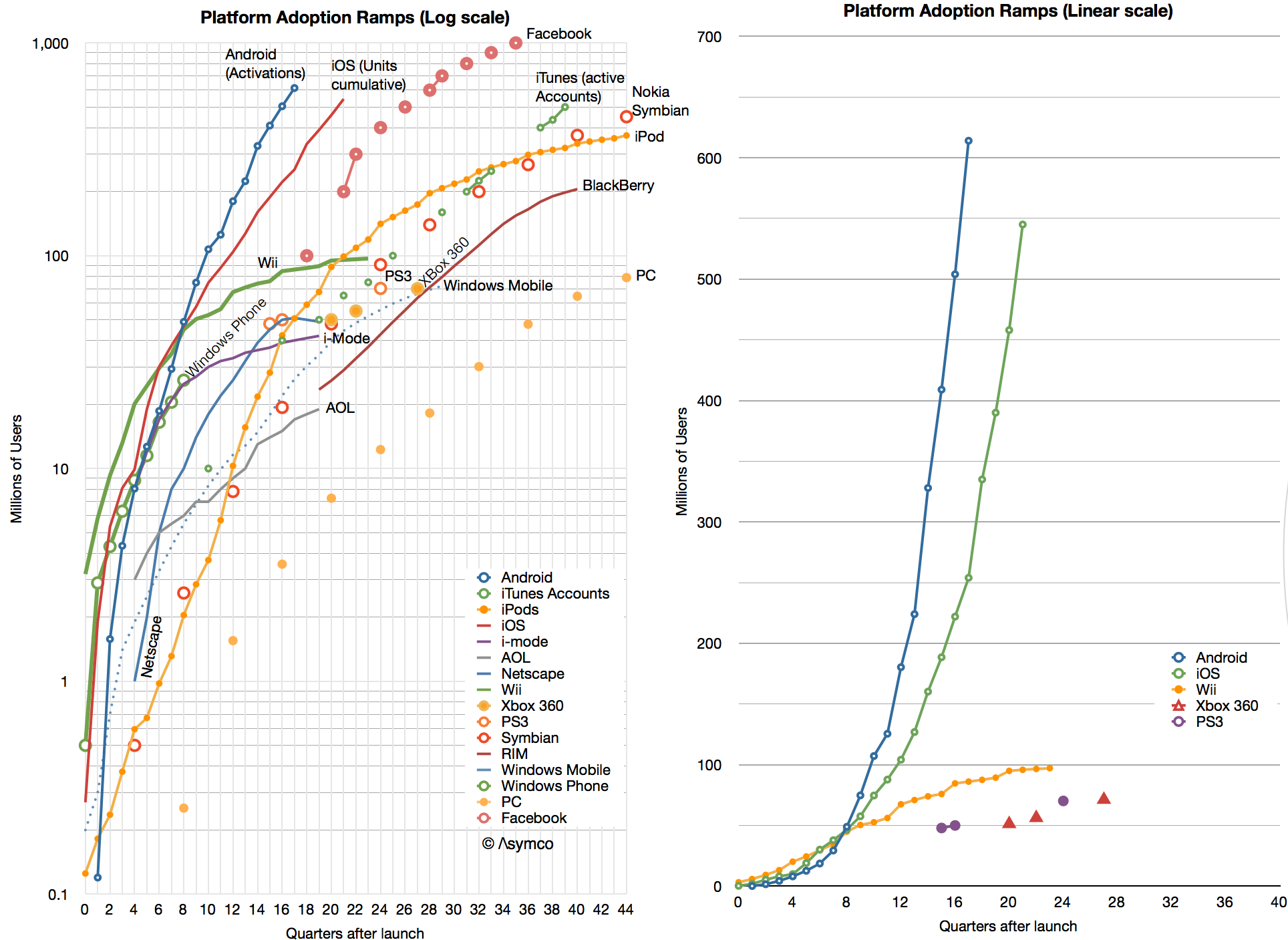
I kept the scale to about a decade so that individual lines can be resolved. As a result, you’ll note that although Windows reached one billion first it did so slowly enough to be off the scale shown. Indeed, the “race to a billion” should be titled “The race to one billion users in less than a decade”.
In such a competition, the winner would be Facebook which, in October 2012, 35 quarters after launch, reached the finish line. The second looks to be Android (probably this year) and the third iOS (sometime next year.)
That may sound like the end of it, but what the graph also shows are the more subtle trends: Continue reading “The race to a billion—2012 Update”
Measuring iPhone 5 vs. iPhone 4S availability
In 2011 Apple increased the availability of the iPhone by adding operators. In 2012 Apple increased availability by bringing the phone to operators more quickly. The question is: how much did iPhone 5 availability increase, exactly?
There is a way to find out. As an approximation, Apple periodically reports the availability of new iPhones by country. For example, Apple stated that they reached 100 countries for the iPhone 5 before 2012 ended. They also gave similar launch data for the iPhone 4S. Graham Spencer did a good job showing how country roll-outs changed over time.
However, country-level availability is not ideal because countries vary greatly in their ability to absorb iPhones. Announcing availability in Mauritius is not nearly as important as announcing Madagascar. A better measure would be to track the countries’ populations being added, or, better still, the populations which subscribe to operators who have a distribution contract with Apple.
Which is what is shown in the following graph:
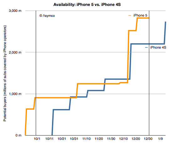
Continue reading “Measuring iPhone 5 vs. iPhone 4S availability”
5by5 | The Critical Path #70: Harvesting Talent
Over-serving TVs, bizarre keynotes, iPhone “mini”, cracking the China code, the T-Mobile iPhone and the iPhone operator deal structure.
via 5by5 | The Critical Path #70: Harvesting Talent.
This was a good show. It also ran longer than usual.
Cracking the China code: Microsoft vs. Apple
In 2011 Microsoft’s CEO bemoaned that revenue in China was about 5% of what it obtained in the US. Yesterday Apple’s CEO suggested that revenue from China will overtake the US in the near future.
The contrast is even more stark when one considers the time and effort each company has made in China. Microsoft has been investing and promoting itself in China for decades while Apple barely had any presence 3 years ago.
To put a finer point on this I show below Apple’s sales by region:
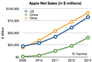
Apple’s China net sales in fiscal 2009 were only 769 million. In 2012 they were $22.8 billion. That is a figure greater than US sales three years earlier. Put another way, China sales grew in three years as much as they did in the US in 33.
The growth rates were astronomical: over 250% in 2010 and 350% in 2011. In 2012 the growth slowed to 83% but that is still almost twice the US or the global average. The growth rates are shown in the following chart: Continue reading “Cracking the China code: Microsoft vs. Apple”
Getting to know the meaning of sisu
Nokia announced 4.4 million Lumia smartphones were shipped in Q4. That’s about 14 million since the Lumia line was launched a year earlier. It isn’t however nearly enough to replace the lost sales from Symbian. One year earlier Nokia shipped 19 million Symbian phones in the fourth quarter and the year before 28.3 million. The history of smartphone sales from Nokia is shown below:
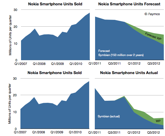
I repeated the forecast I drew up in February 2011 when the platform switch was announced. That forecast was based on the company stating that 150 million Symbian phones would still be shipped. Symbian fell far more rapidly than I (and Nokia) expected and to date only 98 million have shipped. The last quarter’s 2.2 million seems to be so low that it will be hard to imagine the platform lasting more than a few quarters. Continue reading “Getting to know the meaning of sisu”
A more complete picture of the iTunes economy
As it did yesterday, on occasion Apple reports the cumulative total downloads and payments to developers. Since this is done in variable time intervals, it makes analysis of the value of the app store difficult.
But not impossible.
The provision of developer revenues means we can determine the pricing of apps. The pricing of apps and the download totals allows us to determine the revenue of the store. Using the time stamps of the reports allows us to determine these quantities over time.
I’ve combined the data we have so far into the following graph.
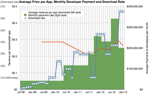
It shows three quantities (on three separate scales) at a monthly resolution:
- Download rate (in millions/day, interpolated from download totals)
- Payment rate to developers (reported change in payment to developers/reported time interval)
- Resulting revenue per download (in red, trailing average over a 10 month period)
Having a price and quantity of app downloads allows for a complete picture of App Store revenues over time, shown below: Continue reading “A more complete picture of the iTunes economy”
App Store Download Rate Forecast
Apple reported over 2 billion unique app downloads (excluding re-downloads and updates) in December. The total downloads reached 40 billion, payments to developers reached $7 billion and the total iTunes accounts reached one half billion.
The total downloads is shown relative to total songs is shown in the following graph:
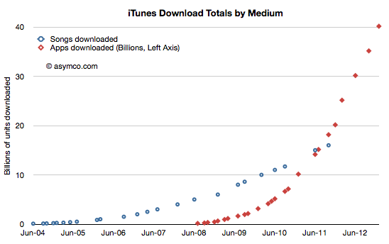
Although we have not received an update on song downloads for some time, it’s probably safe to assume that twice as many apps have been downloaded as songs.
This data can be reduced to a download rate: Continue reading “App Store Download Rate Forecast”
Estimates for Apple’s first fiscal 2013 quarter
I’ve postponed my estimates for the fourth calendar for a long time. The reason is that there have been conflicting data to deal with and I’ve been hoping for some clues to give clarity. Unfortunately, even though I waited, I have not received many clues. Here are the challenges we have to deal with in this quarter:
- Management gave very low guidance for the quarter’s earnings and sales. Normally this should not be a concern since the long-term pattern has been for them to “sandbag” significantly. For example last year’s fourth quarter was guided at $9.3 EPS while the company delivered $13.87, a 49% “beat” to their guidance. However Q2 and Q3 beats were only 7% and 13% respectively and if we assume a similar number (10%) for Q4 we get about $13/share which would be a year-on-year decline in earnings (down from $13.9). This has not happened for many, many years. Management explained this through a lengthy set of reasons including a shorter quarter (13 weeks vs. 14 weeks), new product launches, currency fluctuations, deferrals and unfavorable component pricing. Then again, similar explanations were used in the past with no reflection in what actually happened.
- Management also launched a large number of new products. This normally leads to a surge in sales. In fact, 80% of revenues would come from a new portfolio of products. Having such a broad launch quarter into a holiday, would normally imply huge growth. Not only is this a critical launch quarter for many products but they also rolled out the iPhone to more markets more quickly than ever: 100 countries in three months. The broad roll-out implies a steeper ramp in production and thus more volumes. This would also contradict the lowered expectations from the CFO. However… Continue reading “Estimates for Apple’s first fiscal 2013 quarter”