For more analysis of Apple & the industry, join us at ACTIVE 2025.

The Android Income Statement

This is a continuation of the “Android Economics” series of posts. It deals with how revenues and costs are categorized for Android.

The following diagram shows an approximate representation of what Android’s “Income Statement”[1] would look like.


I’ll discuss the assumptions that are built into the model as I go along. I’ll begin at the upper left and move toward the lower right in the discussion. Continue reading “The Android Income Statement”

Android economics: An introduction

Android has had unprecedented growth. Based on activation announcements, it’s possible to estimate that thus far, about 370 million Android devices have been activated. The total number of devices in use is a lower figure which depends on replacement rate and retirement rate. This total number of devices in use at year end is estimated in the following chart.

I added the blue line which represents what Google had as an internal estimate in mid-2010.[1] The difference between the two lines shows that Android’s growth is far higher than what the company expected.  If the company itself did not expect this growth, it’s unlikely anybody else did either.

Unexpected, exponential user growth is usually accompanied by a dramatic positive improvement in the finances of a company and a higher return to shareholders. The curious aspect of Android’s success is that it has not had an impact on either. The market has not “discounted” the half-billion anticipated Android users into a price for Google shares that reflects this growth. It can only imply that those users are not very valuable.

But why would there be such a disconnect between the number of users and their value? Continue reading “Android economics: An introduction”

The Critical Path: The First Year by Horace Dediu — Kickstarter

The Critical Path has been an exceptionally well received podcast. It has an audience of hundreds of thousands of thoughtful listeners. Many of the concepts covered can and should be reviewed in a medium that can be referenced and annotated and shared. For this reason I would like to publish edited transcripts of the podcasts as an eBook. This will be an edited and tagged transcript of the first year of The Critical Path.

via The Critical Path: The First Year by Horace Dediu — Kickstarter.

Back to the balance sheet

I first noted a correlation between Apple’s share price and its balance sheet a year ago. In February, when I last checked, Apple’s share price was priced nearly at 4.6 times its cash value. The stock has had a brief rally but has returned to the trend line it’s had since late 2008.

I should emphasize that this correlation between cash and price is abnormal. It should not be happening. Share prices for growing companies should be tracking its future potential, not its assets. I’m only presenting this data to highlight this abnormality. There is no fundamental basis for this happening. In fact, there is a basis for this not happening.

The relationship above is a symptom of another pattern called multiple compression that can be seen in the following charts:  Continue reading “Back to the balance sheet”

The phone market in 2012: a tale of two disruptions

During the first quarter this year HTC, RIM and Nokia all surprised investors with bad news. The effect is evident in the share price of these companies which, in the case of RIM and Nokia is around book value, and in the case of HTC, neared 12 month lows and a 70% drop from peak.

These “misses” in earnings and expectations are on top of the already woeful news from Sony Ericsson and Motorola, which have not had profits for years and LG, which has been borderline since late 2009.

In combination, this seems to imply a dearth of profits in an industry that is, by all measures, booming. Units are up 7% with smartphones up 47%. Revenues are up 20% and overall profits are up 52%. This are exceptionally strong numbers. Few industries can measure growth in double digits.

So if the industry is booming but the majority of participants in the industry are loss making (and surprisingly so) then what is going on? There are two answers: new market disruption and low end disruption.

The new market disruption is the migration of a large number of demanding customers away from phones-as-voice-products to phones-as-computing-products. The low-end disruption is the migration of a large number of less demanding customers from branded phones to unbranded, commodity phones.

The New Market Disruption

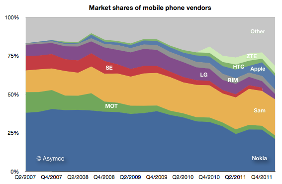
The new market disruption is evidenced by the shift of fortunes to Apple and Samsung and away from every other device maker. Here is the profit picture:

Of the vendors tracked (public companies who report mobile phone divisional performance), Apple obtained 73% of operating profits, Samsung 26% and HTC 1% [1][2]. Continue reading “The phone market in 2012: a tale of two disruptions”

5by5 | The Critical Path #36: An Interview with Clayton Christensen

Horace interviews his teacher Clay Christensen to discuss his new book, How Will You Measure Your Life. We discuss some of the concepts of learning, jobs to be done and approaches to self-disruption. We also cover what Clay is working on next in his writing and research. Lastly, we talk about what Apple should worry about in its disruptive journey.

via 5by5 | The Critical Path #36: An Interview with Clayton Christensen.

400 million phones per quarter and everything's topsy turvy

Sony Ericsson is no more. The company remains but the brand is gone. Now the phones it makes will be sold under the Sony name. Unfortunately, that means we no longer get reports from the company on its volumes, profitability and sales. The units will be part of “Other” from now on.

That vendor’s data disappears as did HTC’s and Samsung’s earlier reporting. Bit by bit, vendors are withdrawing information. RIM stopped reporting its average selling prices some time ago, Motorola may disappear completely and they already stopped reporting tablet sales.

This makes the picture of the market fuzzier each quarter. We have to rely more and more on analysts who publish estimates. I try to pick from the available data the best assumptions but the errors are undoubtedly increasing. Here are the charts showing unit volumes in terms of absolute, share and ranking.

Continue reading “400 million phones per quarter and everything's topsy turvy”

Which is best: hardware, software or services?

Apple’s recent margins are nothing short of spectacular. It’s hard to convey just how remarkable 47% gross margin and 39% operating margins are. For a company that sells hardware these are simply unheard-of numbers.

The best way I can illustrate this is by comparing Apple’s operating margins with those of two other platform-based companies, Google and Microsoft.

Microsoft invented the software-as-a-business model and, as software is easily reproduced, their margins are phenomenal. The gross margins are typically in the 80% range for software. Overall, the company had higher R&D and SG&A expenses so their operating margins are a more modest 37% on average. However, Apple managed to exceed this value even though it has the disadvantage of actually having to build things made of atoms. Continue reading “Which is best: hardware, software or services?”