For more analysis of Apple & the industry, join us at ACTIVE 2025.

Enter, Prise

Historically, Apple’s sales to business and government buyers of personal computers have been, in a word, minuscule. To put a number on it, Forrester published data where the estimated value of those sales in 2007 were 2.8%. A figure lower than Apple’s overall market share of PCs in that time frame.

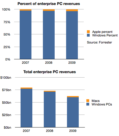
Things did not improve much in the years following. The following chart shows the split between Windows and Mac OS X for the value of enterprise computers sold in 2007 through 2009.

Apple’s share of value went from 2.8% to 3.7%, an increase of 1 point of share, but one which in real terms was not very valuable because the overall market declined due to recession. Revenues for Apple were basically flat at around $2 billion each year as shown in the second chart.

However, the situation changed very rapidly in the last two years. Continue reading “Enter, Prise”

The effect of smartphone growth on share prices

Data on Q4 performance is starting to trickle in. Last week Motorola, as part of a profit warning, revealed their Q4 smartphone shipments were 5.3 million. RIM had reported 14.1 million units (quarter ending November). HTC has also warned that their shipments of smartphones (and tablets) totaled 10 million. Samsung provided guidance on overall sales but since they don’t report data on smartphone (or phone) sales, the estimates are ranging between 32 and 35 million.

Many have forecast Apple’s performance but there are many other companies which are not easily estimated (Sony Ericsson, LG, Nokia, ZTE, Others.) But rather than dwelling on the specific quarter, we can make some long-range estimates of performance based on the historic data.

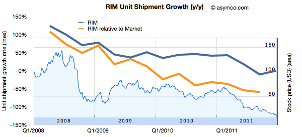
One method I use is to look at patterns of growth. Growth is the first derivative of market performance and it sometimes shows patterns which the performance itself does not. Consider the following chart showing the growth pattern for RIM.

The blue line shows the absolute year-on-year quarterly growth based on reported numbers of smartphones shipped. I’ve also shown the growth “relative to market” which is unit growth with market growth subtracted. This orange line represents how much faster (or slower) the company is growing relative to the market. If the orange line is above zero, the company gained share. If it’s below zero, it lost share.

I also overlaid the performance of the share price (right scale).

Now compare that with another long-term incumbent in the smartphone market, Nokia.  Continue reading “The effect of smartphone growth on share prices”

Predictions for 2012

I have none to offer.

It may sound strange to hear me say that I don’t make predictions even though I often talk about how things will change and even provide some forecasts. The difference is one of degrees. A prediction to me is a very specific, time-sensitive and materially valuable recommendation. An observation about the future is an imprecise, intuitive hunch based on pattern recognition. It’s mushy. It’s theoretical. It’s the difference between saying a company is great and recommending to buy its stock with a price target in a time frame.

But it gets even weirder.

Continue reading “Predictions for 2012”

Estimating iPhone sales in the US during Q4

Verizon has been the first source of data on iPhone sales for Q4. They reported 4.2 million iPhones sold. The first quarter of Verizon iPhone sales had 2.2 million units, followed 2.3 million in Q2 and 2 million in Q3. The total for the calendar year came at 10.7 million.

The total for AT&T during the first three quarters has been 9.9 million. If we assume the same 2x sequential increase in Q4 relative to Q3 as observed by Verizon we obtain an estimate of 5.4 million iPhone for AT&T.[1]

The quarter also saw the addition of Sprint to the US iPhone distribution network. Sprint is rumored to have committed to buy 30.5 million iPhones over the next four years. My estimate for the first year was 7 million, placing first quarter sell-in at about 2 million.

An approximate total for Q4 US iPhone activations results in 11.6 million. The following chart illustrates these estimates: Continue reading “Estimating iPhone sales in the US during Q4”

5by5 | The Critical Path #20: Below the (belt)line

Horace and Dan begin a journey through the financial carnival that is Hollywood and talk about the wonders they encounter.

via 5by5 | The Critical Path #20: Below the (belt)line.

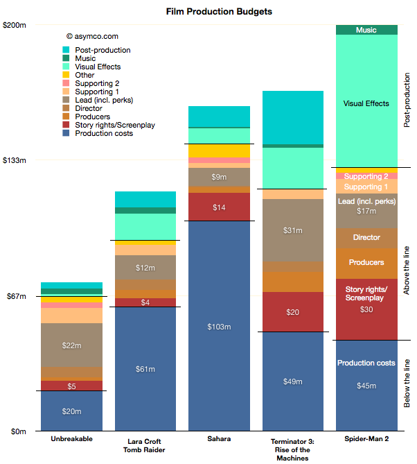
During the show I refer to the diagram below which represents the allocation of costs of production for a sample of movies:

Interactive Apple Analyst Data

As the quarter is now at an end, it’s time to once again review the performance of Apple’s most highly paid observers. The data set linked includes published quarterly forecasts starting quarter ending June 2008 to quarter ending September 2011. Thanks to Philip Elmer-Dewitt who collected and processed the data over several years.

Apple Analyst Data | asymco. (Requires Flash)

As with previous interactive data sets, this is based on Motion Charts “gadget” in Google Docs. Try selecting the Motion Charts tab at the bottom of the page and hit the play button.

The way this is set up now is that the origin (0,0) represents actual performance (labeled as “Oppenheimer”). Every bubble is an analyst’s performance measured as a distance from actual. The further the location of a bubble from origin, the worse the error. Placement above zero (or to the right) indicates over-estimation for Revenues (and EPS). Placement below zero (or to the left) indicates under-estimation. Color of bubble represents affiliation (professional or amateur). Size of bubble is iPhone unit error.

You can change the axes, chart type (tabs in upper right), size, colors, and track individual analysts’ performance (by checking a name checkbox). Or just download the data and analyze on your own by selecting from the Data tab.

The curious case of slowing US growth for Android

The latest data from comScore MobiLens is showing an uncharacteristic slowing in smartphone growth. In the survey period ending November, the number of smartphone users in the US was 91.4 million. This is equivalent to 39.1% penetration, an increase of 0.6% (i.e. up from 38.5% in the last period.)

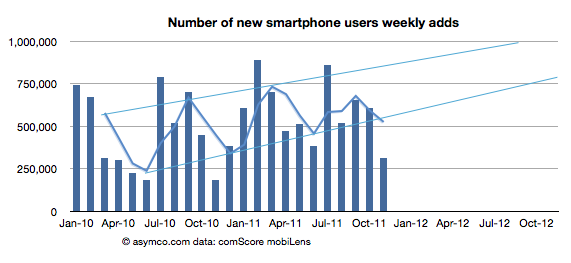
The growth is equivalent to 1.4 million new smartphone users (i.e. users who switched from a non-smart device for the first time.) The problem is that this is half the growth of the previous period. The following chart shows the growth as the weekly add rate.

As you can see, the growth has fallen to a level not seen since 2010. The cause may be seasonal as last November was also a slow month. I added a three month moving average which shows that although there seems to be seasonality, the last period did not show the peak of previous periods.

To better understand what happened, I looked at the performance by platform. The following chart shows the net user gains by platform. Continue reading “The curious case of slowing US growth for Android”

5by5 | The Critical Path #19: The hiring and firing of milkshakes and candy bars

In this episode I talk with Bob Moesta, a pioneer of Job To be Done research. We go over the theory and process of understanding what products are really hired to do and ask why this understanding is so hard to come by.

In a discussion rich with examples from multiple industries Bob illustrates how marketing, design and engineering are all dancing around the question of how product should be developed.

Could the universally accepted compartmentalization of corporate functions be a root cause of product failure?

via 5by5 | The Critical Path #19: The hiring and firing of milkshakes and candy bars.

You can follow up with Bob here: The Re-wired group.

Discerning Apple's international product positioning through the big Mac index

Thanks to all those who contributed to the big Mac index there is a substantial amount of pricing data available in one location.

The analysis that I hoped to perform on the data was to see if Apple was pricing specific products differently in international markets. It was prompted by some apparently anomalous pricing of the iPhone 4S in Brazil.

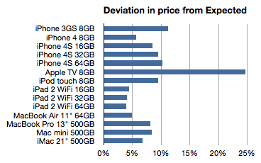
To summarize, the idea is to calculate the “expected” price of an Apple product by taking the untaxed US price and adding duties and tariffs and taxes to determine what that product “should” cost in another country. Then taking the difference between this “expected” price and the actual price to determine if Apple is using pricing to signal in a particular market.

The analysis basically eliminates the effect of government on price and leaves currency and actual pricing signals from Apple as variables.

The analysis is not simple because there are many obscure tax rules. Some products are taxed differently in the same country. I have not completed the country-level analysis but have been able to see some averages over the countries reported (total of 45 reports.)

The following chart shows the average deviation from “Expected” as a percent:

Here are some potential interpretations of this data: Continue reading “Discerning Apple's international product positioning through the big Mac index”