For more analysis of Apple & the industry, join us at ACTIVE 2025.

Estimates for Apple's first fiscal 2012 quarter

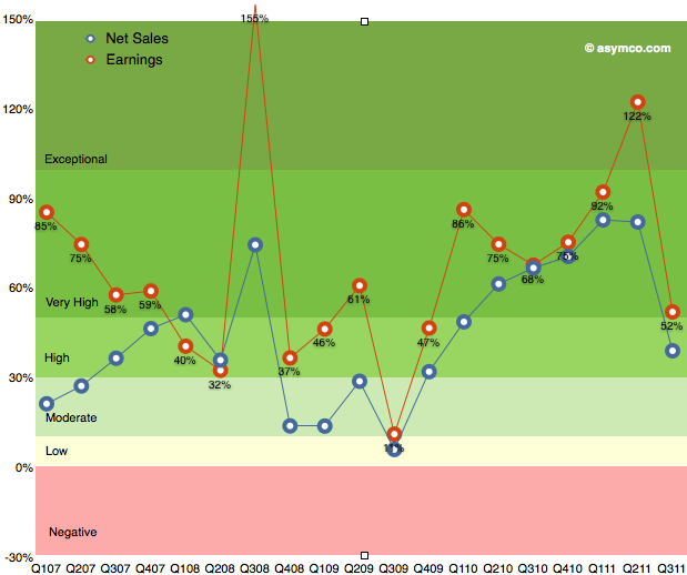
As the chart below shows, the last quarter (third calendar, fourth fiscal 2011) was slow with only 52% earnings growth. The discussion centered on the (surprisingly) disruptive effect of the iPhone transition. Surprising since most analysts, myself included, were lulled into thinking that the portfolio of iPhones and their wider distribution would create a smoother sales pattern vis-a-vis the more cyclical pattern seen in the first three years of production.

The second quarter was surprisingly strong and the third was surprisingly weak. So how do we estimate the fourth? Continue reading “Estimates for Apple's first fiscal 2012 quarter”

How productive is an Apple store employee?

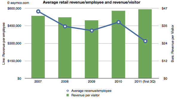
Apple publishes data about its “retail segment” which ifoAppleStore.com catalogs. Here are some statistics I was able to compute from the data:

  • The stores generate over $100k per employee per quarter. In 2010, revenue was $481,000 per employee. This year the average is around $320k excluding the fourth quarter. In 2009 the average revenue for the technology sector was $388k/yr. A retailer like JC Penney generates about $124k of revenue per year per employee.
  • The revenue per visit is around $45. There are well over 250 million visits per year (222 million for first three quarters of 2011).

The combination of these two metrics are shown in the following chart:

Will Windows Phone get to compete with non-consumption?

Before diving into the answer to the question in the title, there is some new data to digest.

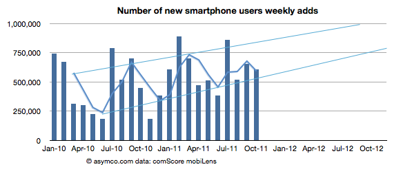
The latest from comScore shows consistency with the previous months of smartphone growth in the US.

  • The growth rate was 607k/wk new-to-smartphone users. This is slightly down from 654k/wk for the previous month but up significantly from 450k/wk the year before.
  • The penetration of smartphones reached 38.5% (non-smartphones are at 62%)
  • The penetration should reach 50% before September 2012 with about 1.2% being converted every month.

The following chart shows the weekly add rate with a three-period moving average:

This chart is important in that it should first show signs of inflection in growth. Continue reading “Will Windows Phone get to compete with non-consumption?”

Android vs. iPhone

It has no price and hence there are no ways markets can signal demand or value creation. Furthermore, Android is not being offered to users like the iPhone. Android’s “customers” are phone vendors who package the software with additional value-added hardware and sell the combination to operators or distributors who then package it further with services and offer the total to end users.

So obviously, comparisons between Android and iPhone center on instances of Android used in real products and the “market performance” of Android therefore relies on these proxies for Android — the aggregate sum of products that have some form of Android in use.

I wrote this in response to a very short brief: “We’re looking for an editorial piece that comes down on either side of the debate of iPhone vs. Android”. The challenge I saw was on the approach to the question of “iPhone vs. Android”. I chose to measure value creation by the means available to shareholders.

Read more here: Horace Dediu Android Vs. iPhone on BusinessInsider.com

[I am posting this here in the hope that comments will accrue to this forum as well.]

5by5 | Mac Power Users #65: Workflows with Horace Dediu

(Note this is not the Critical Path, but a guest appearance on the sister show Mac Power Users.)

Episode #65 • December 5, 2011

Katie and David are joined by Asymco publisher Horace Dediu, who talks about how he researches and publishes his analysis of the mobile marketspace and his thoughts on the future of presentation tools.

via 5by5 | Mac Power Users #65: Workflows with Horace Dediu.

Does Growth Matter?

In last week’s discussion of Apple’s (historically low) valuation, comments arose that perhaps the company’s discount is not unique. Can we look at comparable companies and determine whether the relationship between growth, size and valuation are consistent?

The challenge is in finding “comparable” companies. Apple is characterized by being large in terms of market capitalization, highly profitable, in the technology sector and growing relatively quickly. One can find a cohort of companies with each of these characteristics but not all.

Here is an attempt at looking at the largest companies by Market Capitalization (the so-called Mega-caps) to spot patterns of valuation. Some of the companies in the top 20 mega-caps were technology companies so I thought I’d highlight them. I then also added a few of the top 20 technology companies by capitalization to create a larger sample.

The group I settled on is shown in the list below ranked by market cap.
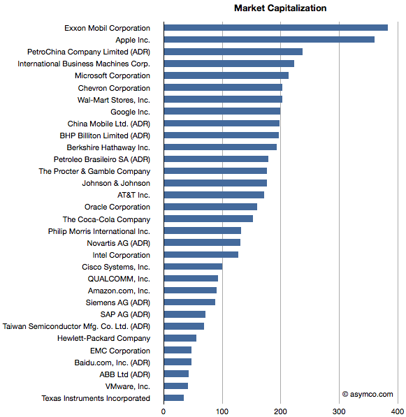
Companies below $130 Billion in market cap (i.e. below Novartis) are in the top 20 technology list but not in the top 20 overall list.

I then plotted the P/E rate vs. 5 year Growth Rate for these companies, separating the tech sector by color (Red):
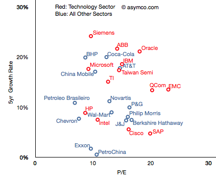
The pattern is not encouraging. It appears that there is no correlation. Perhaps the technology companies are, as a group, further up and to the right, but overall they are equally unobservant of growth.

For example, SAP has grown less than 5% in five years and yet enjoys a P/E of 20 whereas Microsoft has grown 18% and has a P/E of less than 10. The non-technology sector companies are similarly broken. Berkshire Hathaway, a conglomerate, is rewarded for slow growth and China Mobile is punished for relative high growth.

But you’ll notice that some companies are not on this chart. That’s because they are outliers. Their growth or P/E are so far out of this cluster that the would make it impossible to discern individual performance. The complete “top 20” picture is shown in the following chart which will require either a large display or a lot of scrolling (1300×1364 pixels): Continue reading “Does Growth Matter?”

The big bang theory of computing

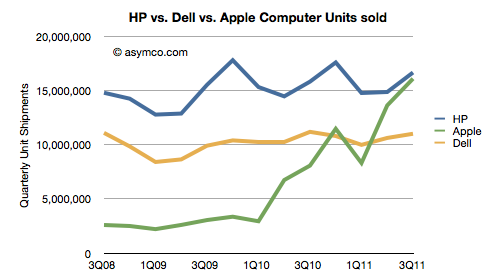
HP’s CEO Meg Whitman admitted that, when iPads are included, Apple will overtake HP as the world’s leader in computer shipments.

“We need to improve our game and our products to take over the leadership position. Apple could go past HP in 2012. We will try to become the champion in 2013.

When the quarterly shipment data is seen as a chart the doubt of this happening disappears:


Note that the combined iPad+Mac has already overtaken Dell. In fact, Continue reading “The big bang theory of computing”

The thermodynamics of Apple's share price

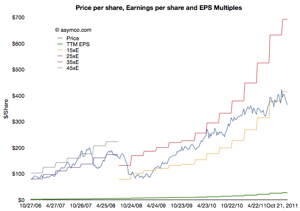
Andy Zaky at Bullish Cross wrote a great post on Apple’s valuation, showing the deep discount of Apple’s earnings vs. an average company. It essentially states that Apple’s money is not green.

Felix Salmon took it forward by enumerating a few explanations that might be used for the despondent valuation. None are successful arguments, but that should not be a surprise.

To understand the phenomenon a bit more precisely, I maintain and think about these charts:

This shows Apple’s share price (“P” in blue) and its earnings per share (“E” in green). In addition Continue reading “The thermodynamics of Apple's share price”

Interactive charts for Apple's product lines

Warning: This requires Flash.

This is a data set that shows Apple’s product-level performance according to Units sold, Average Selling Prices, Cost of Sales, Gross Margin, Unit Growth, Revenues, Revenue Growth and Gross Margin contribution. It, along with all the other data sets are available under the Products menu at the top of this page.

Default settings:

  • Line Chart
  • Y-Axis set to Revenues.
  • Color set to GM (Gross Margin percent).

Continue reading “Interactive charts for Apple's product lines”

Asymco

Asymmetric Competition

Skip to content ↓