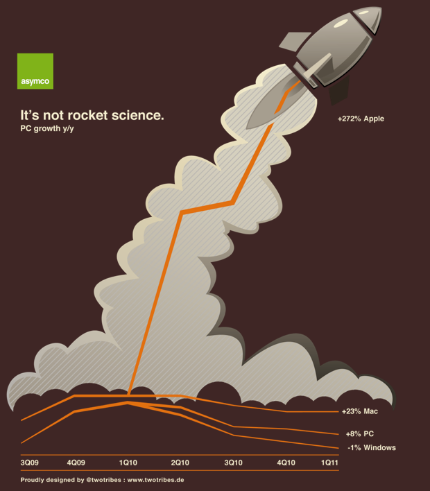
Announcing the Asymco Store and the first Asymco T-shirt

In celebration of one year of Asymco.com, the Asymco store is now open.

Home – Asymco Store

I am extremely grateful to Michael Burgstahler of Two Tribes design for leadership in creating the first t-shirt design:

Based in the home town of Mercedes Benz and Porsche, Two Tribes has been in the creativity business for 18 years with clients like Ricoh, State Bank of Baden-Württemberg, Bosch and Siemens. They even built an app “Favorelli” and opened a little shop for home decoration.

This masterpiece, along with a logo only version is available now.

Is RIM's management the cause of its failure?

“Jim and Mike brought the company to where it is … which is part of the biggest problem they’re facing,” said Charter Equity analyst Ed Snyder, who has covered RIM since its public listing in 1997, two years before the BlackBerry was launched.

“They’re stuck in the past. They know what worked and keep playing that card and it’s not working any more, and they don’t seem to have any ideas,” he said.

via BAY STREET-As RIM struggles, talk of a change at top surfaces | Reuters.

In the case of Apple, the departure of the founder is considered a grave threat to the continuing success of the company.

In the case of RIM and Microsoft, the continued tenure of the founders is considered a grave threat to the success of the company.

Clearly, the theory that founders of successful companies can assure continuing success is flawed. Coupled to that implied causality is that departure of founders is always a problem.

Both are reflections of the idea that companies are predominantly successful (or fail) because of the skill (or incompetence) of a small group of individuals.

What the idea fails to explain is why companies fail (or succeed) as a cohort. RIM’s troubles are similar to Microsoft and to Nokia’s. Did they conspire or collude to fail simultaneously? Historically, incumbents fail simultaneously, regardless of who’s in charge.

And what about the problem that a company goes from success to failure (and vice-versa) while the same management is in charge. The “smart manager” theory of company success is as pervasive as the “stupid manager” theory of company failure. The perplexing thing is that while both of these theories are applied within the lifetime of a company, the management does not change.

Microsoft has received five times more income from Android than from Windows Phone

Microsoft gets $5 for every HTC phone running Android, according to Citi analyst Walter Pritchard, who released a big report on Microsoft this morning.

Microsoft is getting that money thanks to a patent settlement with HTC over intellectual property infringement.

Microsoft is suing other Android phone makers, and it’s looking for $7.50 to $12.50 per device, says Pritchard.

HTC Pays Microsoft $5 Per Android Phone, Says Citi.

A rough estimate of the number of HTC Android devices shipped is 30 million. If HTC paid $5 per unit to Microsoft, that adds up to $150 million Android revenues for Microsoft.

Microsoft has admitted selling 2 million Windows Phone licenses (though not devices.) Estimating that the license fee is $15/WP phone, that makes Windows Phone revenues to date $30 million.

So Microsoft has received five times more income from Android than from Windows Phone.

Looking forward and assuming that Microsoft can receive this type of settlement from about half of the Android license takers, then the prospects of a windfall from Android dwarf the expected income from Windows Phone.

Google’s Android seems the best thing that could have happened to Microsoft’s mobile efforts, ever.

I could also calculate how the Android license income could be further funneled to Nokia (via their current agreement with Microsoft) for promotion of its phones. Thus, an Android licensee could reduce his margins in order to promote a competitor’s products.

A new mobile phone market index

Measurements of “share” are abundant. There is journalistic value in summarizing performance in a single figure of “share” but it usually is a very limiting view. For example in the global mobile phone market there are at least the following measurements available:

  1. Share of all handset units sold
  2. Share of installed based of handsets (penetration)
  3. Share of smartphones
  4. Share of mobile computers
  5. Share of value (revenues) captured
  6. Share of profits
  7. Share of platforms
  8. Share within a given platform
  9. Share by regions/countries/geographies/demographics

One could go on. So performance in a market can only be measured if you know to what end is that measure applied. Are you trying to determine current performance or are you assuming that the future will be different and trying to figure out what that future will look like?

Continue reading “A new mobile phone market index”

A disruption is not sufficiently described by the success of some. Others must fail.

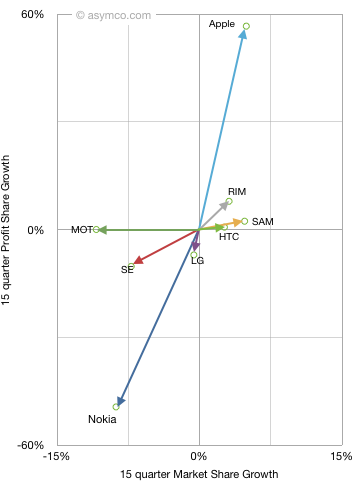
Last fall I introduced the “vector space” model of visualizing vendor performance. It shows performance along two dimensions: market share growth vs. profit share growth for a set of competitors.

When introduced, I chose a long time frame (15 quarters) to see the long-term pattern. This quarter I add two more time frames: year-on-year and sequential. This allows a view of how market change is itself changing. The three diagrams are shown below (note difference in scales)

Continue reading “A disruption is not sufficiently described by the success of some. Others must fail.”

Why the phone market is resilient to low-end disruption

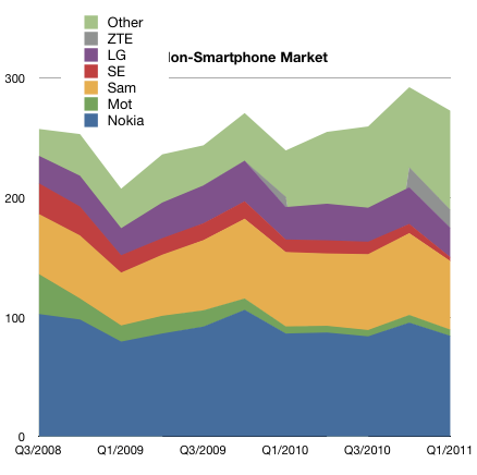
The phone market excluding smartphones is not growing. Over a three year period it grew at 2% compounded.

The following chart show the make-up of the market by vendor.

Since it is not expanding rapidly, share over time has a lot more meaning. Continue reading “Why the phone market is resilient to low-end disruption”

"Other" vendors sell 10% of Smartphones but 30% of voice-oriented phones

In the last post, I highlighted the difference between smartphones and non-smart device sales last quarter. The trajectory of share growth for smart devices would appear to have accelerated due to Android.

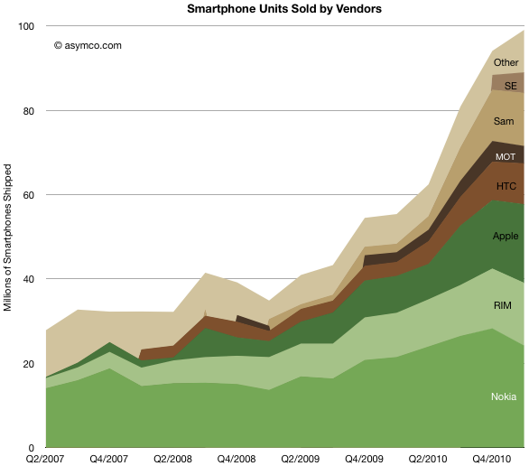
The following charts show the evolution of smartphone vendors and platforms over the last few years.

Like in the past, I used color clustering to show the separation between “integrated” (in green) and “modular” (in brown) platforms and their users.

Unlike the non-smart market where “other” make up 30% of the market, smartphones are still a big brand business. “Other” make up only 11% of units. and that number has been trending down. It would seem that the age of unbranded Android phones is still not upon us.

Comparing three years “before and after” here is Q1 2008 vs. Q1 2011 by vendors share: Continue reading “"Other" vendors sell 10% of Smartphones but 30% of voice-oriented phones”

Smartphones: the end of the beginning or the beginning of the end?

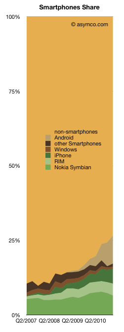
The smartphone market grew to about 100 million phones last quarter. The volumes grew sequentially and as a result reached a new record share of 27% of total phones shipped. The chart on the left shows how this market evolved over the last few years.

I’ve added each platform’s contribution.

While much of the focus will be on who had what share, the better question might be who has the better chance to beat smartphone non-consumption? Non-smart devices are still the dominant competitors. Though it’s getting easier to win against them, they still have some compelling competitive advantages.

What the chart shows is that Android (and phone versions of iOS) have taken share from direct competitors but have taken more from non-consumption. Rather than focusing on rivalry between platforms, minds should be focused on the shape of the smartphone adoption curve.

The market is largely un-penetrated and yet some argue that “it’s too late” to enter or that “the game is over” and winners have already been decided. This is an argument that we are at the beginning of the end. Once the market is predictable it’s discountable. Once it’s discountable it becomes economically uninteresting.

I’ve argued that this is far from certain. In a short span of a few years, a decades old business has been re-defined. But that was just the device side of a larger business. Smartphones have been, so far, sustaining to the telcos who capture the vast majority of revenues and are thus the true incumbents.

If and how they will be affected by further evolution of smart devices and new business models around them remains to be determined.

The Rawr Chart

The challenge with any performance metrics is that there is no single measure of business performance which is conclusive. The last few posts have covered mobile phone vendor performance measured by various methods. Growth (sequential, yearly and compounded multi-year),  margins, shares (units, profit and sales), rankings and time series. I’ve distinguished between smartphone pure plays and the diversified. Each is trying to shed light on what is a multi-dimensional puzzle.

I’ve used various charting tools and visualizations and they each render some clues, but the following chart is one of my favorites. It shows the way operating profit was distributed among the top vendors.

The areas each represent the profit from mobile phone sales in Q1. The horizontal axis shows the volume of units and the vertical the profit per unit. It thus shows how “efficiently” profits were captured a unit basis. It also shows at a glance the different strategies employed and how they reflect performance. It shows who made money and who didn’t. It shows the magnitude of differences.

The shape of this chart has not changed in the last few quarters but it prompts speculation on how it might change in the following few years.

I struggled to find a catchy name for this type of chart but @JustinD put it well here. Rawr indeed.

Apple, RIM and HTC captured 75% of mobile phone operating profits in Q1

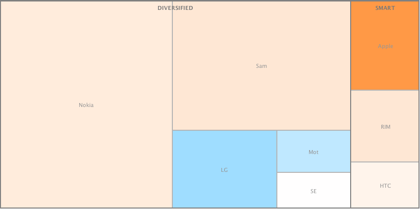
I produced two alternate views of the primary mobile phone brands in terms of volumes sold and operating profit in Q1.

These views[1] allow a comparison by categorized competitors. I grouped dedicated smartphone vendors (SMART) vs. diversified and used color coding for profitability (blue colors indicate loss-making vendors).

The same view is drawn for profitability. Loss-making competitors are excluded. Continue reading “Apple, RIM and HTC captured 75% of mobile phone operating profits in Q1”