Game over

In the “Race to a Billion” there is a graph showing Android reported activations and iOS cumulative unit sales alongside cumulative console sales. The contrast between mobile phone platforms and game consoles is striking, with an order of magnitude difference in consumption. The best performing console to date is the Wii with about 100 million units sold so far.

[UPDATE: Thanks to Danny Nemer cumulative sales of Sony’s PlayStation 2 (using production shipments from FY 2000-05 and recorded sales for FY 06-12) is 155.81 million units]

However, that is an incomplete picture of the game platform business primarily because consoles are not the entirety of the business. Mobile (but dedicated) gaming platforms have been sold for some time.

To give a better picture of the game business we prepared the following graphs. The first shows Nintendo’s product lines with actual unit shipments (shown as colored dots in millions of units per quarter) and the trend (shown as trailing twelve months’ average trend lines).

Screen Shot 2013-09-09 at 9-9-4.45.30 PM

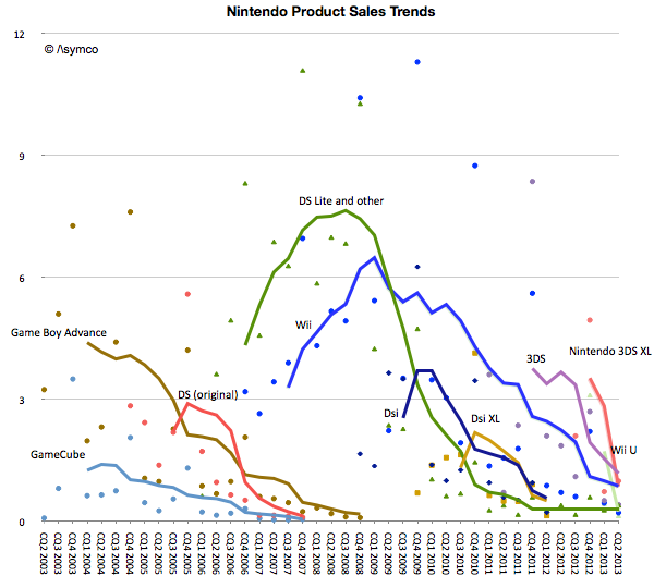
Note that fixed and mobile products are both shown on the same graph. The picture that emerges is that for Nintendo, its mobile platforms combined are more popular than its fixed consoles with a total of 186 million mobile devices sold since 2003.

There is also a pattern of generational change. The GBA, DS and GameCube era was superseded by the DS Lite, DSi, Wii era. The Wii era (or generation) was significantly more popular than the GameCube generation. If there is a problem however, it seems to be that the new generation devices or consoles are not forming a new era. The Wii U and 3DS are not growing nearly to the level of the previous generations and have faded quickly.

To summarize, the unit volume graph for Nintendo is below.1 Continue reading “Game over”

  1. This is a smoothed graph showing what sales would have been if they had been evenly spread out over a 12 month period. The actual sales would total to the same area but would be much more seasonal and thus noisy. []

Measuring iOS as a gaming platform

At this year’s WWDC Apple offered an update on Game Center accounts. The data we have so far is shown in the following graph.

Before being acquired, another network, OpenFeint, announced 180 million iOS accounts in October 2011. Another figure to consider is the 40 million subscribers to Xbox Live (out of 66 million Xbox users). This subscriber base is paying for a service (about $1 billion per year) so it’s not the same as the free Game Center model.

Rather than being a revenue source, Game Center is designed to engage users and to capture usage information. It also lets us gauge gaming “consumption” on iOS devices. That itself allows us to contemplate it as a gaming platform vis-à-vis alternate platforms.

To consider the figure as a proxy of penetration and engagement, the graphic below shows cumulative sales of gaming devices.[1] Continue reading “Measuring iOS as a gaming platform”

What retail is hired to do: Apple vs. IKEA

“Within five years after discount retailing pioneer Korvette’s opened its first store in 1957, over a dozen copycat discounters had emerged. In contrast, the giant discount furniture retailer IKEA has never been copied. The company has been slowly rolling its stores out across the world for [close to 50] years; and yet nobody has copied IKEA.

Why would this be? It’s not trade secrets or patents. Any competitor can walk through its stores, reverse engineer its products and copy its catalog. It can’t be that there is no money to be made: its owner Ingvar Kamprad is the third richest person in the world. And yet nobody has copied IKEA.

Our sense is that the other furniture retailers have followed the positioning paradigm and defined their business in terms of product and customer categories, which are readily copied. Levitz Furniture, for example, sells low-cost furniture to low income people. Ethan Allen sells colonial furniture to wealthy people.

IKEA, in contrast, has organized its business around a job to be done: “I need to furnish my apartment (or this room) today.”  When this realization occurs to people anywhere in the developed world, the word IKEA pops into their minds. IKEA is organized and integrated in a completely different way than any other furniture retailer in order to do this job as well as possible.”

Integrating Around the Job to Be Done (Clayton Christensen, Harvard Business School; Scott Anthony, Innosight LLC, Scott Cook, Intuit; Taddy Hall, Advertising Research Council).

IKEA is the world’s leading furnishing retailer and an amazing success story. As Christensen points out the success is all the more perplexing because it seems perfectly defensible. Nobody has tried to duplicate or undermine IKEA.

Positioned around a clear job-to-be-done it integrated design, manufacturing and distribution (including warehousing) as well as “big box” retailing as an experience.

This may sound familiar.

Apple’s entry into retail depended on a clear job-to-be-done, design, carefully selected merchandise and retailing as an experience. Similar to IKEA, Apple also became a dominant player in its segment and even achieved seventeen times better performance than the average US retailer in terms of sales per square foot.

At first glance they seem to be similar businesses in terms of strategy or “architecture” but how do the actual businesses stack up? Can we find data to support any claim of similarity. Continue reading “What retail is hired to do: Apple vs. IKEA”

The parable of Nintendo

With the launch of the Wii console, Nintendo averted disaster. When the Wii launched in late 2006 Nintendo had been facing the simultaneous attack from the “seventh generation” Xbox 360 which launched a year earlier as well as the PlayStation 3, both of which set as their bases of competition 3D graphics at HD resolutions. Many wrote off the company and called the console market a two horse race.

Then, in what seemed a desperate downward leap, the Wii was launched into a different trajectory. It addressed non-consumers with a new, more intuitive controller and standard resolution rather than competing for hardcore gamers with more power and richer graphics.

Continue reading “The parable of Nintendo”

You cannot buy innovation

In a previous series of articles we discussed the capital Apple expends on equipment, real estate, leasehold improvements and data centers. Cost structure analysis reveals subtle shifts in strategy and the CapEx analysis demonstrates Apple’s increasing integration into its supplier network and integration into the distribution and service infrastructure that sustains its ecosystems.

Another form of investing (spending now, reaping benefits later) is the spending on research and development (R&D). Let’s have a look at Apple’s R&D expenses by quarter since Q1/2006.

Apples R&D expenses as percentage of sales have been declining from almost 4% to close to 2% in the last six years as shown in the following chart:

While Apple’s absolute R&D expenses have grown at an annual rate of 33% they have not kept up with the far higher sales growth rate. Apple’s current rate of R&D expenditure is compared to a peer group [1] below. Continue reading “You cannot buy innovation”

Apple's commoditization discount

When asked where Apple’s growth will come from, most analysts or observers will cite new products. As long as there are new products, then there is growth. Conversely, if there are no new products, then there will be no growth. This is such a commonly held belief that it’s axiomatic: Apple is being valued based on short-term foreseeable growth.

To be more precise, analysts value the wave of growth of every new product and heavily discount the post-growth phase assuming commoditization. There is no value assigned to Apple for extending market reach to the mass market.

Consider: Analysts currently forecast an operating income (or EBIT) of $43.3bn for 2012 and $49.7bn for 2013. That implies growth of 28% in 2012 and 15% in 2013. These growth rates are modest in light of Apple’s recent historic growth and especially 84% in 2011 on EBIT level. Much of this growth has been due to iPhone which quickly captured 4% market share in four years. To suggest 15% growth in 2013 is to suggest that Apple will not increase its phone market share by an appreciable amount. The implicit assumption in that growth figure alone is that Apple will remain a niche player.

Continue reading “Apple's commoditization discount”

Who is being reasonable now?

Last week Horace wrote about the apparent “reasonableness” of analyst Apple estimates. He explained how the consensus for Apple’s growth was always deeply pessimistic because its performance could be argued to be anomalous. It was just too good to be true. We reproduce the chart here:

The estimates look like characteristic “tell-tales” of a company running strong into the wind.

This conservatism in the face of rapid growth sounds “reasonable” but is it always practiced? And what about the ability of this conservative strategy to predict dramatic changes in growth? To test, we started to look at the predictions for RIM. RIM has also enjoyed strong growth over a similar time frame as Apple. How did analysts predict its performance? The following chart was prepared using the same technique as the one for Apple[1]. Continue reading “Who is being reasonable now?”

Growth and punishment: The vector space model

After processing more than 1500 data points on the performance of thirteen technology companies, patterns are beginning to emerge. The steps so far:

The final step is to plot the changes in the relationship between pre- and post-crisis for the set of companies normalized to the same starting point and then classifying them: 

The chart shows how the “average P/Es” changed after 9/30/2008 vs. how the companies performed during those periods. An evocative categorization is suggested for the four quadrants.

One way to read the data would be as a degree of effect of the crisis. Continue reading “Growth and punishment: The vector space model”

Apple's P/E compression illustrated

The reason we look at valuation is that it offers insight into how innovation is perceived. If a company is a successful innovator it usually creates vast wealth for its owners. However, the timing of that wealth creation depends greatly on its recognition by others. In other words, valuation lets you determine how recognizable innovation is. If your analysis tells you that a company is supremely innovative but nobody else recognizes this then you have an investable opportunity.

So with that in mind we like to compare industry and innovation analysis with what “the market” thinks about Apple.

The latest method we had in mind was to compare P/E (a measure of valuation) and Growth. We’ve shown before that they seem to be moving in different directions. That’s not been news for over a year. What we will try to do now is to see if there is discernible change in the relationship before and after the financial crisis.

The following chart is a simple representation of P/E (line chart with left scale) with Net Income growth super-imposed (bar chart with right scale.) We chose a time period of 22 quarters. 11 quarters after the crisis (i.e. quarters after the one ending in Sept. 2008) and 11 quarters before the crisis (quarter ending 12/20/05 through the one ending 6/30/08).

We then plotted a scatter of all these pairs (P/E vs. Net Income Growth). Continue reading “Apple's P/E compression illustrated”