For more analysis of Apple & the industry, join us at ACTIVE 2025.

The US temporarily regains relevance for Apple's iPhone

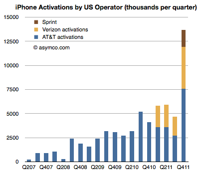
Sprint reported its first iPhone quarter sales at 1.8 million. You may recall my analysis of Sprint’s “gamble” where I estimated that Sprint will easily sell the 31 million iPhone which they committed to buy from Apple. I had estimated that they could sell an average of 7 million units a year but perhaps conservatively they could ramp at 4, 6, 9 and 12 over the four year period rumored to be in the contract.

Given the pent-up demand I also estimated that the first quarter could reach 2 million units. They managed 1.8 and that’s a solid start. Overall the US carriers activated 13.7 million iPhones. Here are the iPhone activations by US Operator:

That’s 37% of the total market in Q4, shown in area and bar charts below: Continue reading “The US temporarily regains relevance for Apple's iPhone”

What did I get right (and wrong) about the fourth quarter?

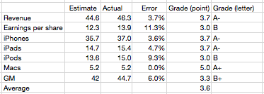
I’ve been publishing my estimates for Apple’s business performance for a few quarters (see here, here and here). My estimates have been collected along with those of dozens of others by Philip Elmer-DeWitt at the Fortune Apple 2.0 blog.

I’ve also been scoring my performance and discussing the causes of errors. Here is the analysis for the fourth quarter 2011.

Continue reading “What did I get right (and wrong) about the fourth quarter?”

Third

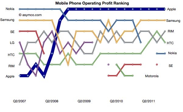
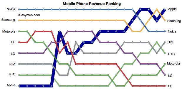
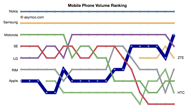
Apple reached the third place rank in total units shipped during last quarter. The following chart shows the ascent in rank.

Apple achieved this with a total market share of about 9%. Second place Samsung has 22.6% so there is significantly more room to go before Apple gets to be second. Nevertheless, the climb to third was achieved in less than five years. At the time when Apple entered the market third place was held by Motorola with shipments of 35.5 million units (Q2 2007). Motorola only managed 10.5 million in the last quarter.

Continue reading “Third”

Pricing Paradox

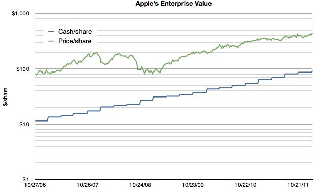
As Apple’s extraordinarily low valuation is being more widely noted, explanatory hypotheses are proliferating. Everyone seems to have an opinion. Some explanations come in and out of fashion. Others are reliable old clichés. We’ve seen liquidity issues with large funds forced to sell, “too much cash”, management transitions, an impending loss of mojo, share price too high to afford, “law of large numbers”, and that old chestnut, competition. None of these satisfy. They don’t explain why reliable growth is not valuable. And reliability is indeed what Apple offers in spades. Consider the following chart:

Note that the scale is logarithmic so that the growth patterns can be seen clearly. Continue reading “Pricing Paradox”

Apple's Fourth quarter 2011 Growth Scorecard

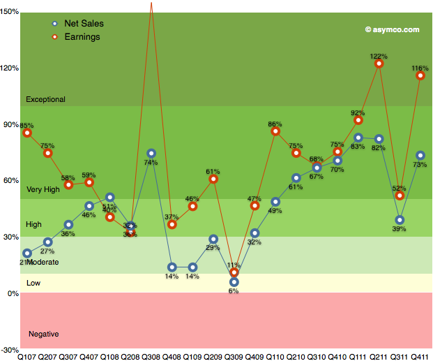
After the transitional third quarter, Apple’s earnings growth returned to an exceptional level. As the following chart shows, earnings growth has maintained above 50% growth since 2009.

Q3 turned out to be a transitional quarter with Continue reading “Apple's Fourth quarter 2011 Growth Scorecard”

5by5 | The Critical Path #23: Auteur Theory

Horace talks to Prof. Bill Torgerson from St. John’s University about the writing process and how it survives and/or thrives as a commercial enterprise. We touch on writing for movies and compare the collaborative process of “content creation” vs. the “single voice” of an author.

5by5 | The Critical Path #23: Auteur Theory.

If you make software you really should pay attention to how art is made. And vice versa.

Show notes:

The year of the iPad for the second year in a row

The iPad and Mac businesses both grew well in the last quarter. Tim Cook said they are observing some cannibalization of Mac from the iPad but much more switching to iPad is coming from the Windows PC market.

The evidence is still hard to pin down directly but the fact that PC sales (excluding the Mac) are down gives credence to the claim. Mac growth, in contrast, is largely unaffected. The following chart shows the the iPad volumes vis-a-vis Mac volumes and the Mac growth through recent history.

The iPad has out-sold the Mac since inception and is now about three times the volume. However, the growth rate in the Mac has not changed much.

The impact on the PC market has been discussed recently and the data in the following chart is an update given more precision on the units from Apple: Continue reading “The year of the iPad for the second year in a row”

Price competition

Apple’s products are often seen as being priced “at a premium”. This is mostly a matter of perception, but in certain categories Apple’s products are priced above the industry average (though probably still affordable to sufficiently large populations). As a result, when competitors launch lower-priced products there is a tendency to expect Apple to react and reduce its prices to compete.

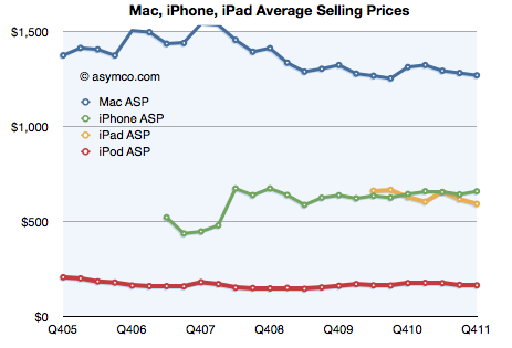
This expectation was evident when AT&T had an exclusive on the iPhone. The assumption among many (expressed in comments here as well as elsewhere) was that a switch to multi-carrier distribution would result in a price reduction and consequently a reduction in margins.

It was evident in the iPod and the Mac businesses over the years as prices for competing products collapsed.

It is also evident with respect to the iPad where expectations are that the Kindle will cause a reduction in the iPad price (and presumably in the margin).

However, the data we have from Apple on their pricing shows no concessions to competitive price pressure. The following chart shows the historic prices that Apple was able to obtain for its main product lines:

Continue reading “Price competition”