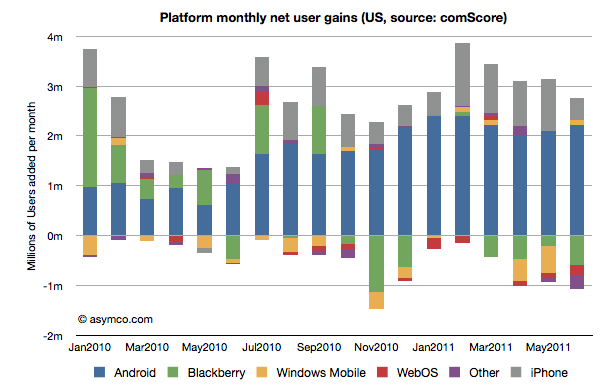
ComScore’s latest survey data shows the following net user gains in the US smartphone installed base:
In summary, the key data points for June: Continue reading “155 million American mobile phone users don't use smartphones”
ComScore’s latest survey data shows the following net user gains in the US smartphone installed base:
In summary, the key data points for June: Continue reading “155 million American mobile phone users don't use smartphones”
The phone vendors’ ranking relative to each other on three measures of share (Unit or Volume, Revenues and Operating Profit) is shown below:
Although not much changed in the unit rankings since last quarter, revenues did see Samsung and Nokia trade places. In the case of Profitability, the chart shows a sparseness that is quite unprecedented. Only positive profit figures are charted.
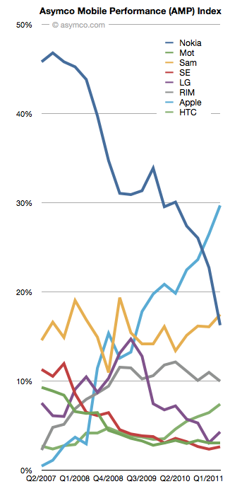
The violence with which new platforms have displaced incumbent mobile vendor fortunes continues to surprise.
This while entrants have grown share in spectacular fashion:
The picture of platform share over time looks like this: Continue reading “The fate of mobile phone brands”
The profitability (aka Profit/Phone x Phones Sold, aka Rawr) chart is a great way to see the “shape” of the industry at a glance, with attention to volume and profitability.
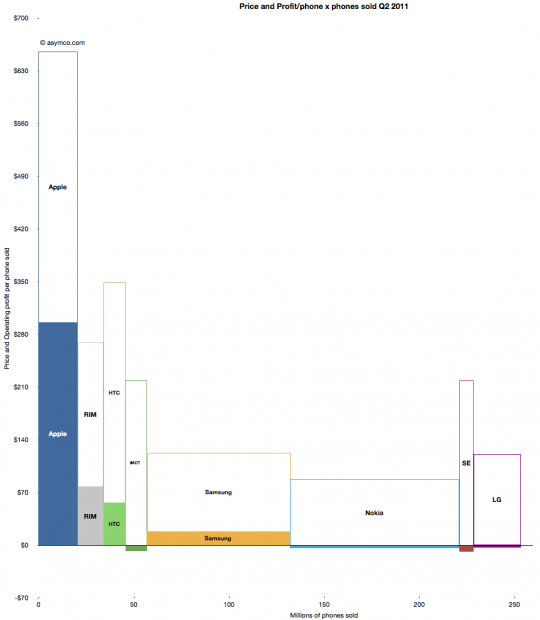
What is missing however is a perception of the sales level and the pricing of the products. To help in that regard, I prepared an extension to the profitability chart which covers the price and sales for each participant.
You can interpret this graph as an extension of the profitability chart where the “empty” or white areas above each profit area are payments to suppliers and operating expenses. Thus the sum of empty and filled areas (above zero) are equivalent to revenues. If the sum of the empty and filled areas are greater then revenues (i.e. they extend below zero) then the difference is operating losses.
The top of both empty and filled rectangles are set at the average selling price per phone (and the top of each filled rectangle is the operating profit per phone). The width of both rectangles is the volume of phones shipped.
The things you can read into this chart are: Continue reading “A new view into the phone market”
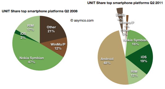
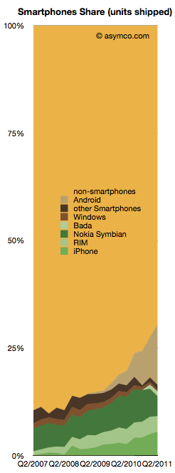
Smartphones made up about 30% of global phone sales last quarter. That is a significant increase from 10% in Q4 of 2007.
From this perspective, iPhone obtained 5.6% share, Android 14.2%, Nokia Symbian 4.6%, RIM 3.6%, Bada 1.1% and Windows 0.4%.
The competition however still has 70.5%.
The chart to the right shows the challenge remaining and the progress being made.
The good news is that the non-smartphone market is not growing while the smartphone market is. In fact, the non-smart market has had a three year CAGR of 0% and a y/y growth of 1.0% and a sequential decline of 6%.
The non-smart portion of each branded vendor’s business is pretty dismal:
The reason all these brands fell is because the unbranded vendors took their place. “Other” non-smartphones grew by 43%. They have been sustaining growth at the rate of 57% compounded over three years.
The following chart shows the increasing share taken by the “other” vendors in non-smartphone units: Continue reading “The Competition”
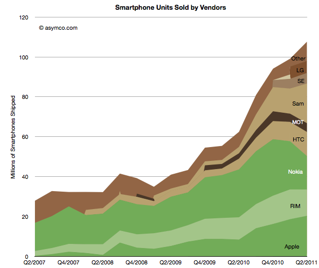
Nearly all the data on smartphone shipments is now available for the second quarter 2011. Some fragments are still not public, including ZTE and Huawei (and any others) shipments. We also have estimates for the various platforms including an estimate for Windows Phone and Bada (though not for WebOS).
This allows the following chart:
Using the traditional color scheme which separates “integrated” from “modular” vendors, the chart shows overall volume growth and how the volumes are split among vendors.
The market grew at about 73% y/y and 50% compounded over three years and 9% sequentially. The y/y growth rates for individual vendors were: Continue reading “The Android and iOS pincer movement”
The number of Bada phones shipped last quarter is not public, however some assumptions can be made that lead to plausible estimates.
First, we know that Samsung shipped about 3.2 million smartphones in Q2 2010 and that total included Bada and Android (and perhaps even some Windows Mobile).
Second, we know that there were about 19.9 million smartphones in Q2 2011.
Third, Canalys published an estimate that Bada grew by 355% y/y.
So if we knew how many Bada phones shipped in Q2 2010 we could derive the current Bada shipments and also realize how many of the nearly 20 million smartphones from Samsung were actually Android.
The clue is in an estimate from December last year Continue reading “The Samsung hedge: Estimating Bada for Q2 and hence Samsung's Android shipments”
As previously pointed out, Apple reached two thirds profit share in mobile phone vendors among the eight vendors I track. The following charts shows the historic growth in that share and the share of revenues (including 4 quarter trend line). Revenue share increased to 28% in the last quarter.
The share doubled from Q4 2009. I should also point out that it was the highest of all the competitors. The following chart shows the split over time: Continue reading “Apple share of phone revenues increased to 28%”
At the end of last year I was saying that the smartphone boom was a tide that lifted all boats. That is no longer the case.
But the big story is that there has been a clear non-seasonal counter-cyclical decline in Nokia and RIM’s smartphone performance. RIM’s steady rise has come to an abrupt halt. Nokia’s decline has accelerate precipitously. So much so that Samsung and Apple have overtaken Nokia and RIM and it looks like HTC will overtake RIM within one quarter and perhaps Nokia as well.
The following chart shows the current profit distribution between phone vendors with an eye toward identifying volume dependencies. The vertical axis represents operating profit per phone and the horizontal axis the number of phones sold.
The area of each vendor bar is therefore the total operating profit that vendor captured. A vertical (portrait) orientation implies high profitability with relative low volume while a horizontal (landscape) orientation implies a high volume/low profitability focus.
The other important observation is that bars can also be negative. Those vendors’ names are listed below the bars rather than within them.
You can also compare the chart with the one from last quarter: