The end of easy growth in smartphones

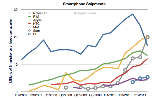
At the end of last year I was saying that the smartphone boom was a tide that lifted all boats. That is no longer the case.


But the big story is that there has been a clear non-seasonal counter-cyclical decline in Nokia and RIM’s smartphone performance. RIM’s steady rise has come to an abrupt halt. Nokia’s decline has accelerate precipitously. So much so that Samsung and Apple have overtaken Nokia and RIM and it looks like HTC will overtake RIM within one quarter and perhaps Nokia as well.

Continue reading “The end of easy growth in smartphones”

The Profit/Phone x Phones Sold Chart

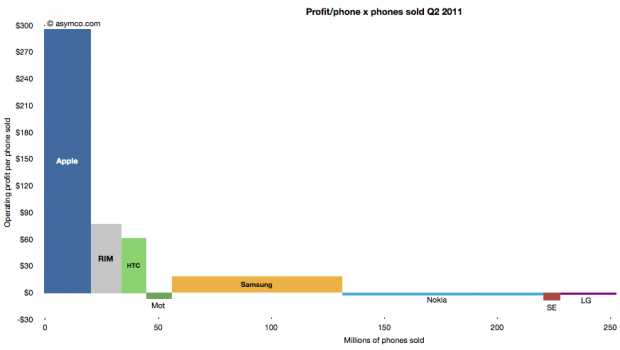
The following chart shows the current profit distribution between phone vendors with an eye toward identifying volume dependencies. The vertical axis represents operating profit per phone and the horizontal axis the number of phones sold.

The area of each vendor bar is therefore the total operating profit that vendor captured. A vertical (portrait) orientation implies high profitability with relative low volume while a horizontal (landscape) orientation implies a high volume/low profitability focus.

The other important observation is that bars can also be negative. Those vendors’ names are listed below the bars rather than within them.

You can also compare the chart with the one from last quarter:

The Rawr Chart | asymco

Apple captured two thirds of available mobile phone profits in Q2

The major publicly traded phone vendors have all reported results for the second quarter. Based on the data available so far we can begin putting together a picture of the market.

The first picture I’ll draw is usually the last: profitability. The following chart shows operating profit from the sale of mobile phones among the eight vendors I follow (Nokia, Samsung, LG, Sony-Ericsson, Motorola, HTC, Apple, RIM).
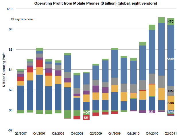
This quarter saw a slight sequential decline in overall profit for the sector, but four vendors did not manage a profit from selling phones. Nokia, Motorola, Sony-Ericsson and LG all saw losses. The other vendors split the slightly decreased pie with Apple getting two thirds of it (66.3%)

This share is up from 57% in Q1 and 50% in Q3 and Q4. Samsung’s share went to 15%, though that’s not a peak level historically. In Q1 2008 the company was at 21%. RIM was at 11%, a level in a range that has been unchanged for three years. Finally, HTC captured 7.4%, a new high and an increase from 6% since last quarter.  The profit share chart follows: Continue reading “Apple captured two thirds of available mobile phone profits in Q2”

The Verizon small bang

As Verizon has reported iPhone sales for one and a half quarters, it’s time to try to discern the impact on the product. There were several hypotheses floating around prior to the “big bang” of Verizon.

Some assumed that there would be a large migration away from AT&T and that AT&T iPhone sales would slump. Others that there would be no Verizon iPhones volumes at all because there were so many Android users already converted. There were also suggestions that the iPhone would explode in growth with two major operators carrying it.

What really happened?

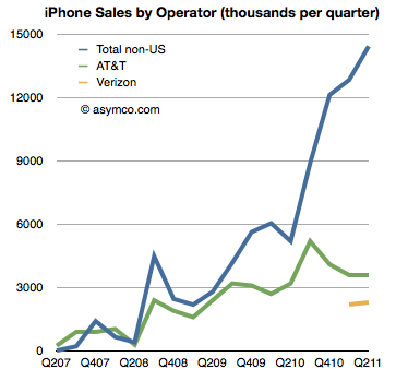
The first chart shows historic AT&T activation with Verizon activations added. It also shows sales to “none of the above”, namely non-US sales of iPhones[1].

AT&T iPhone activations show no significant impact from Verizon and Verizon itself shows a modest start to sales[2]. What did not happen is an exodus from AT&T. We also did not see a rejection of the iPhone by Verizon customers long exposed to anti-iPhone Droid advertising. We also did not see a considerable impact of Verizon on growth.

Verizon did contribute (4.5 million Verizon iPhone users is nothing to sneeze at)  but the contribution was to a degree that was nowhere near a big bang.

That was because the real big bang was from the rest of the world. The same data in the first chart is shown below as a stacked area chart and a share chart. Had Verizon not come on board the business would still have grown year-on-year over 100% (and sequentially). Continue reading “The Verizon small bang”

Visualization of Apple's Income Statement

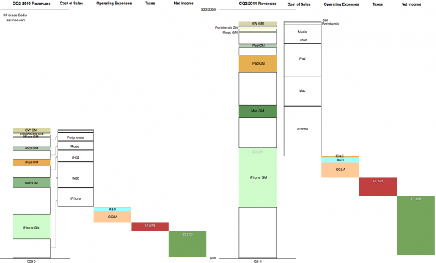
This graphic representation of the current and year-ago sources of income and sources of expense for the company shows how the business evolved in the last year.

The colored segments in the first column are Gross Margin contributions per product for Calendar Quarter 2, 2010. The white segments are cost of sales for those products. These costs are combined in the second column and the operating expenses are shown in the third column, taxes in the fourth and Net Income is shown in the fifth.

The same information is shown for Calendar Quarter 2, 2011. Click for larger view (1440 x 873 pixels)

The increase in the first columns is the “top line” growth and the increase in the last (fifth) columns is the “bottom line” growth

Similar charts for the last few quarters are shown here:

Combating superlatives fatigue | asymco

Summary view of Apple’s income statement [Updated] | asymco

Describing Apple’s growth, cost structure, product-level and overall profitability in a self-explanatory chart | asymco

Apple has moved on

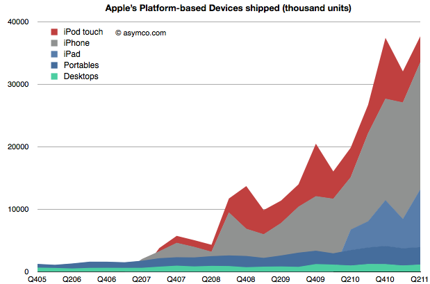
When Apple changed its name from Apple Computer to Apple Inc. they signaled that their business has moved on. We can say it’s to devices or to mobile computing or to the Post-PC era. To understand that this is not a shift driven only by wishful thinking we can plot the change in volumes for the platform-based devices Apple sells.

The stack of products is shown in an increasing level of mobility. At the bottom is the non-portable desktop Mac, above are Mac portables (laptops) followed by the iPad, iPhone and iPod touch. The mobile computers Apple sells are explosively more popular (and important).

To gauge importance consider the following chart which shows the unit values above multiplied by the average price they are able to obtain for a picture of the sales mix. Continue reading “Apple has moved on”

How we do all this will never be the same

In a new ad for the iPad Apple once again makes the case that the tablet is a good substitute for a PC in a number of use cases (and permits some new ones.)

We’ll never stop sharing our memories. Or getting lost in a good book. We’ll always cook dinner and cheer for our favorite team. We’ll still go to meetings, make home movies, and learn new things. But how we do all this will never be the same.

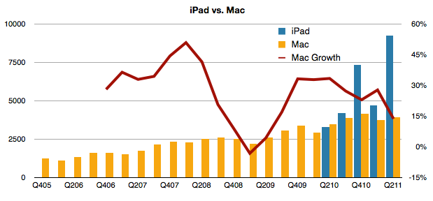
This belief that the iPad “cannibalizes” the PC is a powerful concept. The growth of the PC has certainly been affected. But has the Mac’s growth also been affected?

Tim Cook seems to think so. In the earnings call he said:

In terms of cannibalization, we do believe that some customers chose to purchase an iPad instead of the new Mac during the quarter, but we also believe that even more customers chose to purchase an iPad over Windows PC. And as I’ve said before, there’s a lot more of the Windows PC business to cannibalize than the Mac.

If we look at the behavior of Mac vs. iPad, the following chart may be useful:

Continue reading “How we do all this will never be the same”

Apple's share price (adjusted for earnings and growth) reaches new low

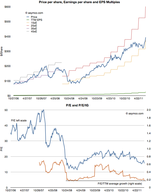
After Apple reported earnings growth of 125% its share price dropped to a P/E of about 15. This reduction in valuation is part of a trend I’ve written about for over a year so there were no surprises. The first chart below shows how the stock has traded between increasingly lowered P/E bands.

As the second chart shows, not only is the P/E ratio declining, but when seen against the trailing twelve months (TTM) average growth rate, the P/E/TTM ratio is now at the lowest since the great recession (around 0.17–a value of 1.0 is a rule of thumb for “fair value” in a growth stock).

Those values include cash. Excluding cash, the P/E as of Friday was 12.4. On a forward basis (my estimate–which has shown be be conservative lately) the P/E is around 7.

Perhaps some day in the future Continue reading “Apple's share price (adjusted for earnings and growth) reaches new low”

A princely sum

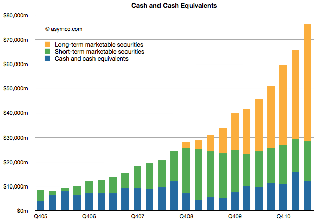
Apple’s cash and marketable securities increased to $76,156,000,000. The increase was 15% sequentially or $10.4 billion in three months. That’s the equivalent of an increase of $11 per share (to a current $81.2/share.)

The composition and growth of liquid assets is shown in the following chart:

There is little I can think to say about this that hasn’t already been said (see last Critical Path show.)

Except maybe that the amount is now nearly 16% higher than three months ago. And that the amount added last quarter is higher than the amount on hand 4.5 years ago. And that the cash added is higher than Google’s overall revenues in the quarter.

Footnote:

In Q1 2009 the company’s share price briefly traded at $78. A buyer of shares at that price will have recovered their investment in retained earnings in nine quarters.

How did I get the iPhone number so wrong?

Here were my predictions for the third fiscal (second calendar) quarter from April 25th.

Estimates for Apple’s third fiscal quarter (ending June) | asymco

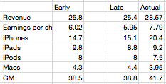
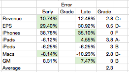
Later in the quarter I updated them for submission to Philip Elmer-Dewitt’s blog at Fortune. The original and updated figures are shown in the following table (with actuals).


The changes were not significant except in a reduction of iPads. Three items were better in the early call and three were better in the late with one item equal. Using a simple method for scoring the results I gave myself the following report card:


As the Revenue and EPS figures are dependent on the other line items, the most significant error is clearly the iPhone where the error was over 30% (and hence deserves an F). The other figures were not very close either  so the overall grade point average is a very mediocre C (2.3).

So, as in previous quarters, nailing the iPhone number is everything. Having failed to guess correctly, the whole performance fell apart.

So how did I manage to get the iPhone number so wrong? Continue reading “How did I get the iPhone number so wrong?”